Freelance product designer specialising in SaaS dashboards and admin interfaces - dense data made scannable, built as a component system. AI, real estate, logistics and marketplace work.
I design SaaS dashboards and admin interfaces - the dense, data-heavy screens that run a business - from $24 per hour. Recent work covers AI workspaces, property management, inventory pipelines, influencer marketplaces and learning platforms.
Dashboards fail in a way marketing sites do not. They are not unattractive; they are unreadable. Every number is present and none of them answer the question the person opened the screen to ask.
The fix is almost never visual. It is deciding what the screen is for, and weighting it accordingly.
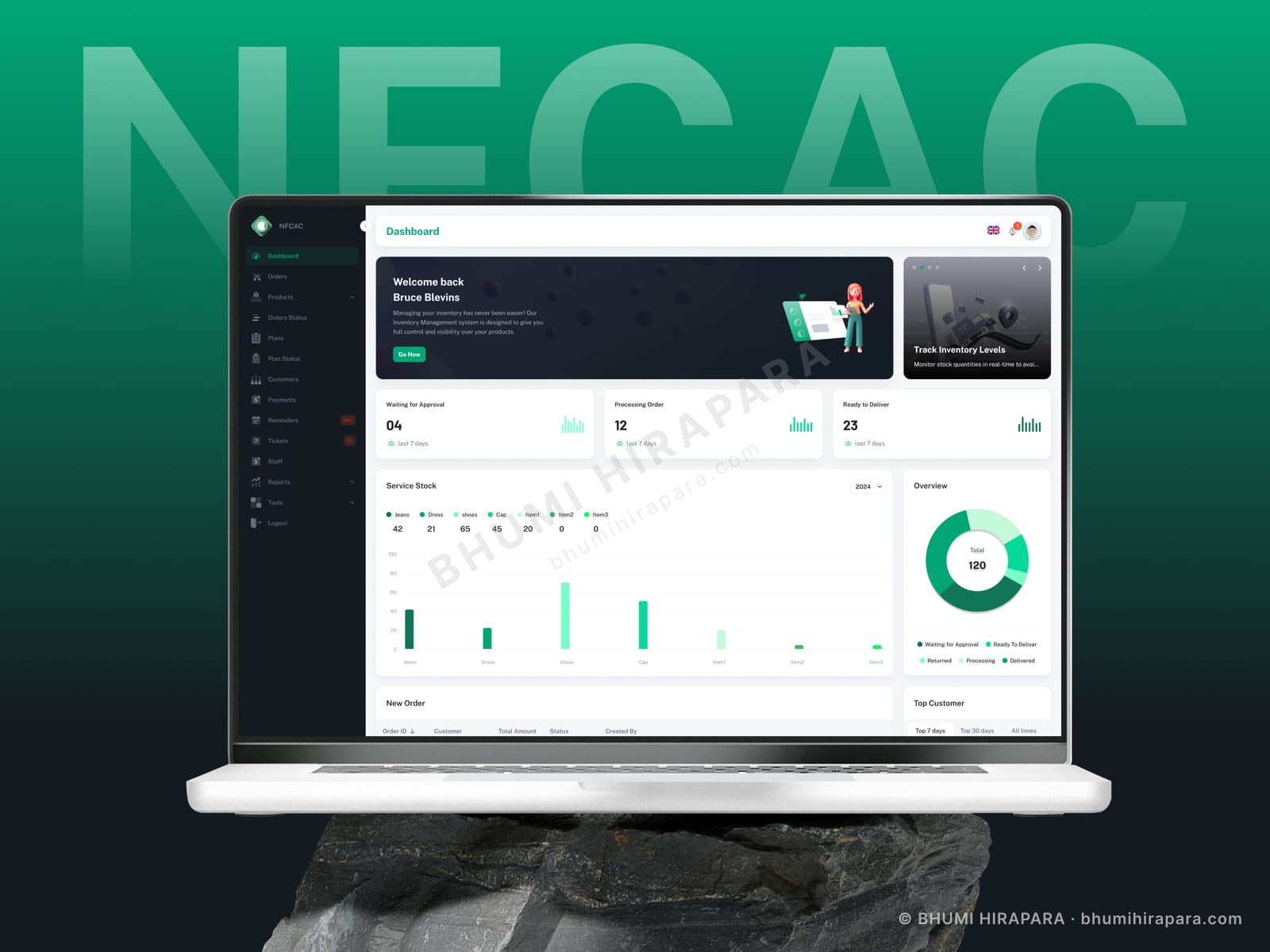
When the underlying process is a sequence - awaiting approval, processing, ready to ship - laying the interface out in that order means staff read the screen the way they think about the job. Presented as unrelated tiles, the same numbers force the reader to reconstruct the pipeline mentally every time.
I built exactly this for an inventory platform. Three separate list screens became one pipeline view where a bottleneck is visible as a shape rather than something you calculate.
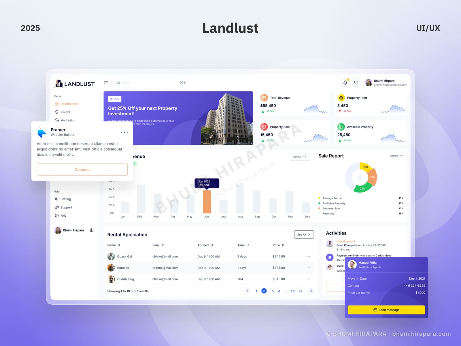
Charts answer questions you already decided to ask. A queue of incoming applications answers a question that arrives on its own schedule with a deadline attached.
So the queue goes in the primary reading path and the analytics sit above it as context. Reversing that is the most common mistake in operational dashboard design: it optimises for the quarterly review instead of for Tuesday morning.
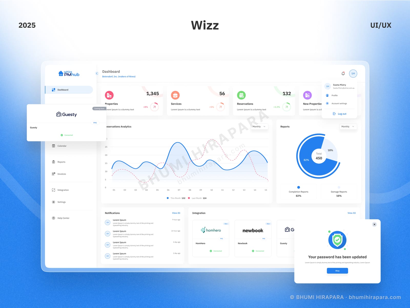
A count tells you the state. A short trend line tells you whether that state is building or clearing, which is what determines whether anyone needs to act today. They cost almost no space and turn a readout into an early warning system.
Dashboards accumulate features faster than any other product type. A layout that ranks its entry points quietly tells users which features are second-class, and has to be rebalanced every time something is added.
I design the component set so a new panel type drops in without renegotiating the whole screen. That decision determines whether the design survives its first year.
From $24 per hour or $900 per week. A focused dashboard redesign runs two to three weeks; a full product design covering multiple screens and a component system runs four to eight depending on scope.
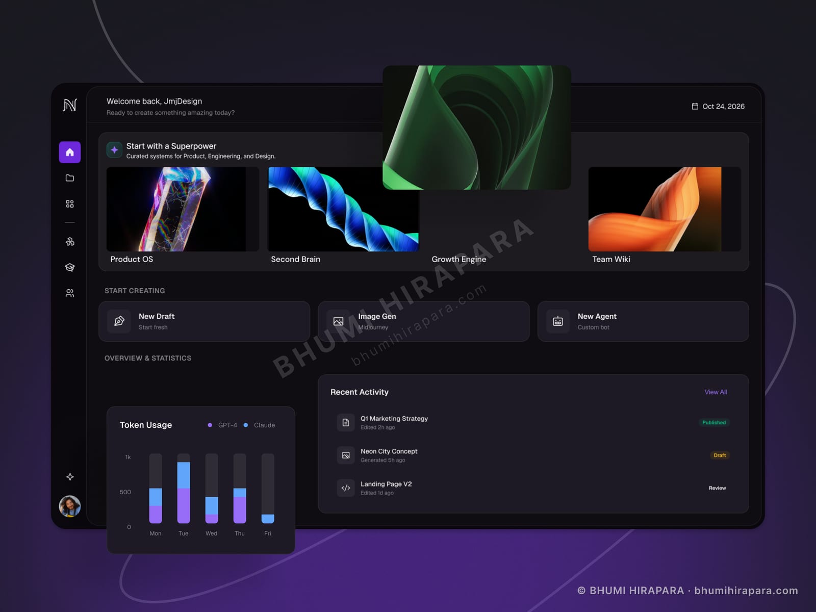
Yes, and for products displaying user-generated or AI-generated imagery it is often the right default - unpredictable content sits more comfortably on a dark neutral. I build both themes from the same tokens rather than designing twice.
Yes. Extending a system you already have is usually better than replacing it, and I will say so even though a rebuild would be a larger engagement. If the system genuinely cannot express what the product now needs, I will explain exactly where it breaks.
Yes - React, Next.js or Astro, with a headless CMS or your API behind it. For data-dense interfaces this matters, because a lot of the real design decisions only surface once real data is in the component.


Full Time Contract Available. Tell me about your project, your timeline and your budget, and I’ll reply with an approach and a rate.
Start a project