- ClientLandlust
- Year2025
- RoleUI/UX Designer
- CategoryDashboard Design
The challenge
Property managers were working across separate screens for revenue, rent collection, listings and applications. Nothing on any one screen answered the question they actually asked each morning: what needs attention today, and is income tracking where it should be.
What I did
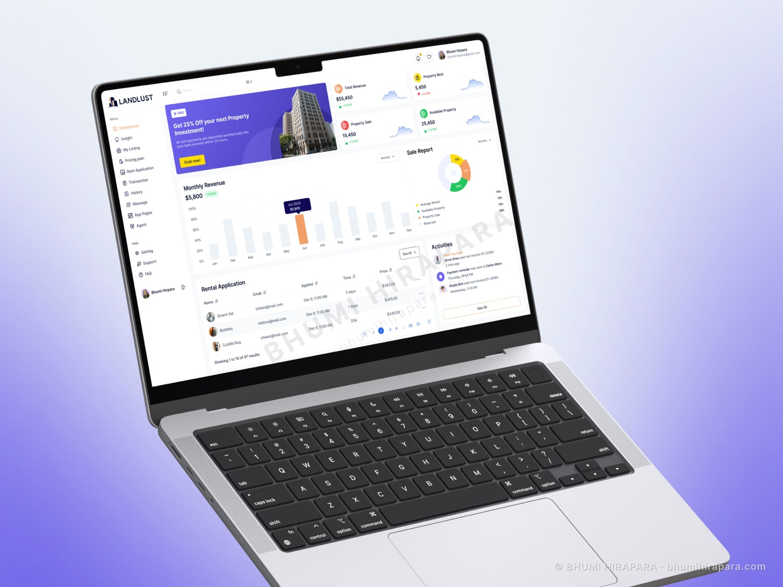
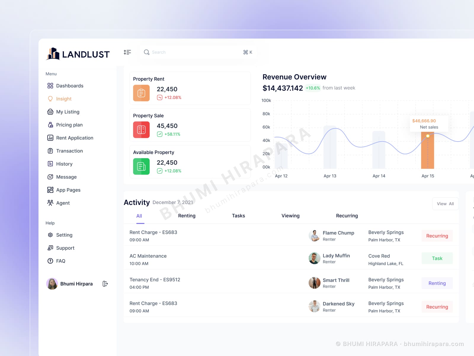
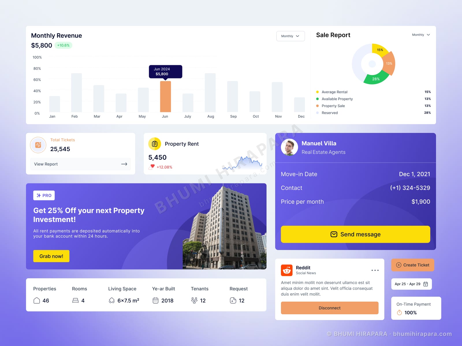
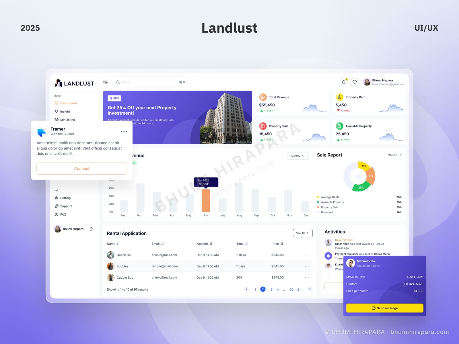
I designed a dashboard that answers both at a glance. A row of financial figures carries revenue, rent, sales and available stock with period-on-period movement, so direction is readable without opening a report. Below it, revenue over the year sits beside a sale breakdown, and the lower half is given to the two things that are genuinely actionable: incoming rental applications and a live activity feed of payments, move-ins and agent assignments.
The outcome
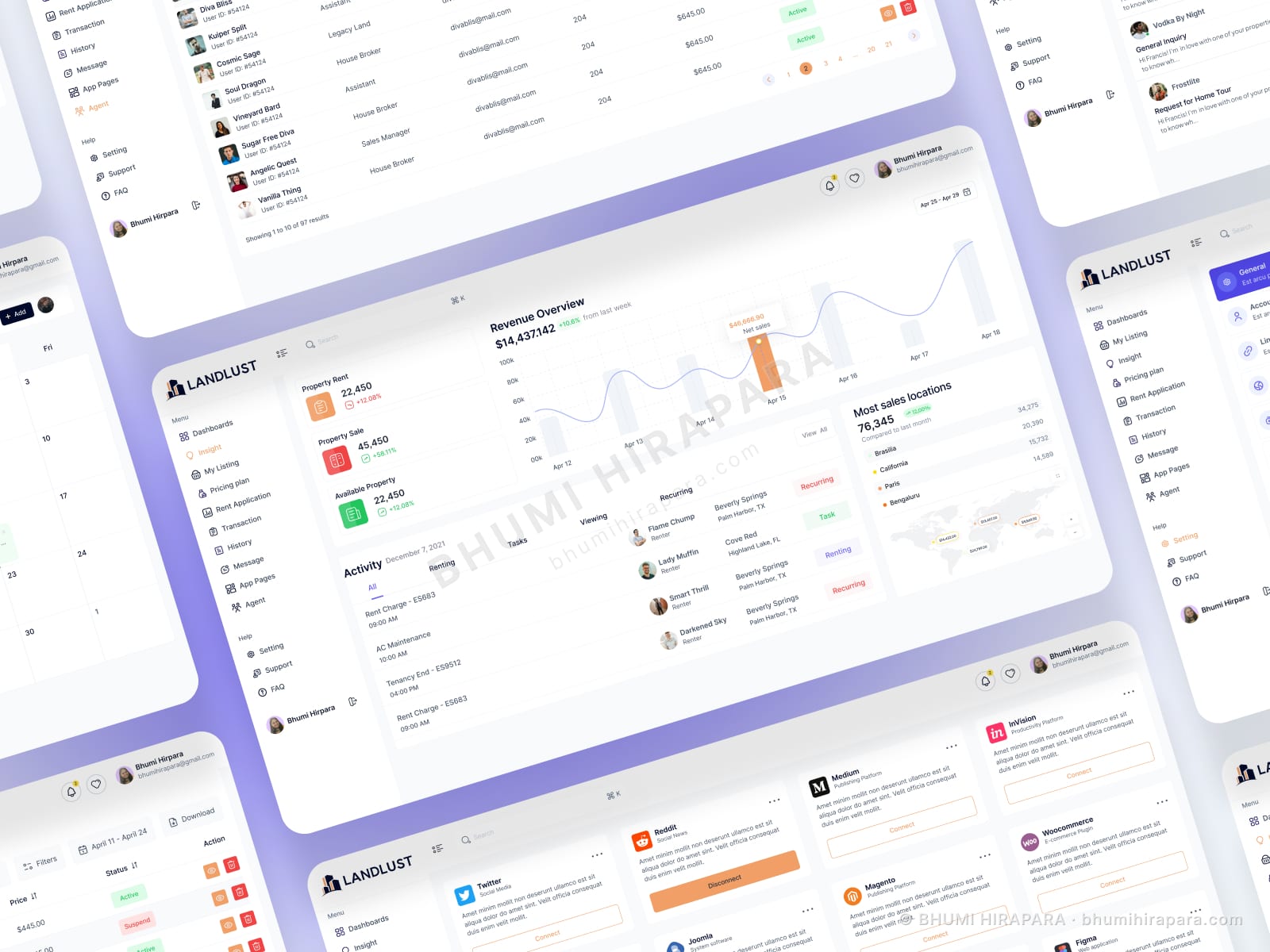
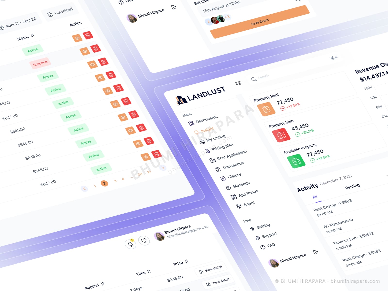
A single operational screen that replaced four, with the actionable items weighted above the analytical ones, and a component set that carries through to the listing and tenant screens.
Stat cards earn their space or lose it
A row of figures across the top of a dashboard is almost a convention, which is exactly why it is usually wasted. Five numbers with no comparison tell you the state of the business and nothing about whether that state is good.
Each figure here carries its movement against the previous period. That single addition turns a readout into a signal, and it costs almost no space to include.
Actionable above analytical
Charts answer questions you already decided to ask. The rental application table answers a question that arrives on its own schedule and has a deadline attached.
So the applications table and activity feed sit in the primary reading path, with revenue analytics above them as context. Reversing that order is the most common mistake in operational dashboard design: it optimises for the quarterly review rather than for Tuesday morning.
Density without noise
Property management data is genuinely dense - tenant names, dates, amounts, statuses, pagination. The instinct is to compress, and the result is a screen nobody can scan.
I kept row heights generous, used colour only for status, and let the table breathe. A dashboard that holds less per screen but is readable in two seconds beats one that holds everything and is read in twenty.