- ClientNeurava
- Year2026
- RoleUI/UX Designer
- CategorySaaS Product Design
The challenge
AI tools accumulate surface area fast. Drafting, image generation, agents, team knowledge and model spend each arrive as a separate feature, and the dashboard becomes a launcher for unrelated things. The brief was a workspace that holds all of it without reading as a control panel only an engineer could love.
What I did
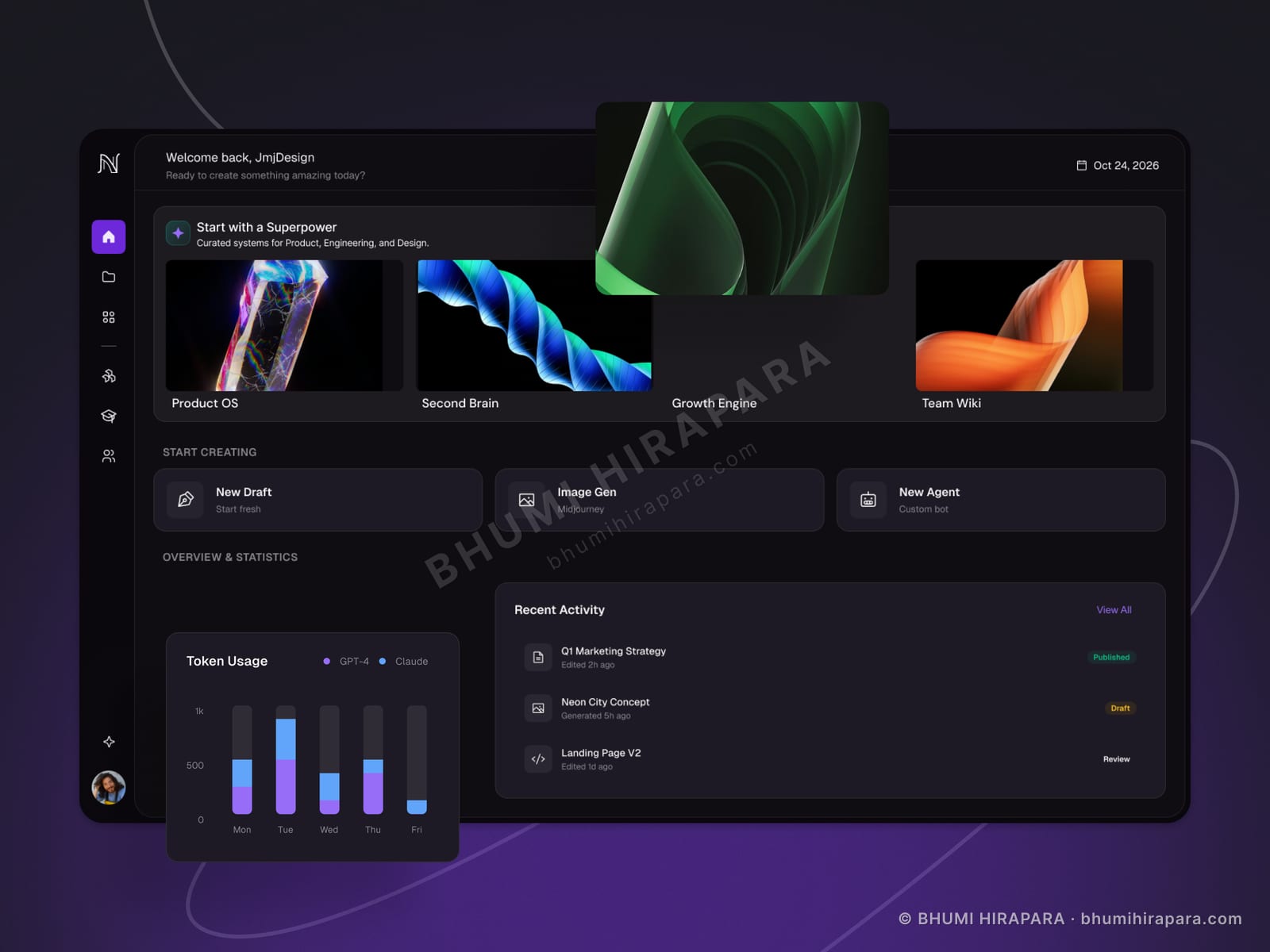
I organised the dashboard around the act of creating rather than around the feature list. The top of the screen is a curated set of starting points; below it sit the three primitives a user actually invokes - new draft, image generation, new agent - as equal, obvious entry points. Token usage, which is normally buried in billing, is surfaced as a small chart beside recent activity, because on AI products spend is something users watch daily rather than monthly.
The outcome
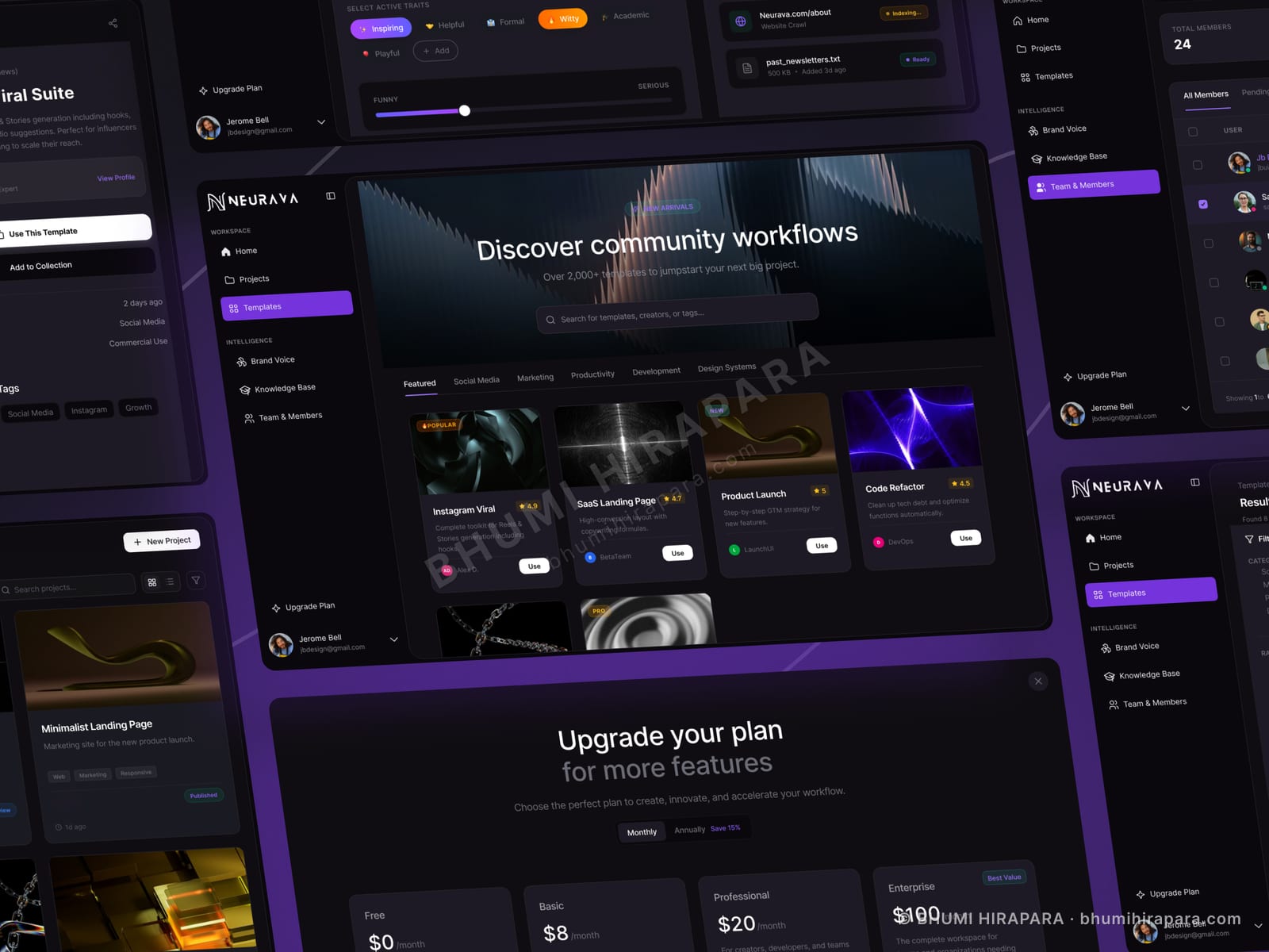
A dark interface that stays legible across dense data and full-bleed generated imagery, a consistent card system that absorbs new feature types without redesign, and model spend visible where users already look.
Designing for generated content you cannot predict
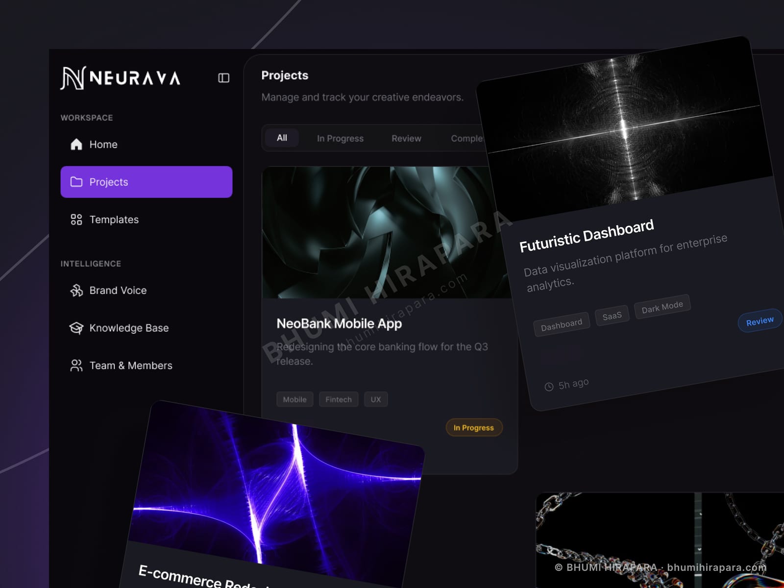
Conventional product design assumes you control the imagery. An AI workspace does not: the thumbnails are whatever the user generated, which might be a near-black render or a saturated orange abstract, often side by side in the same row.
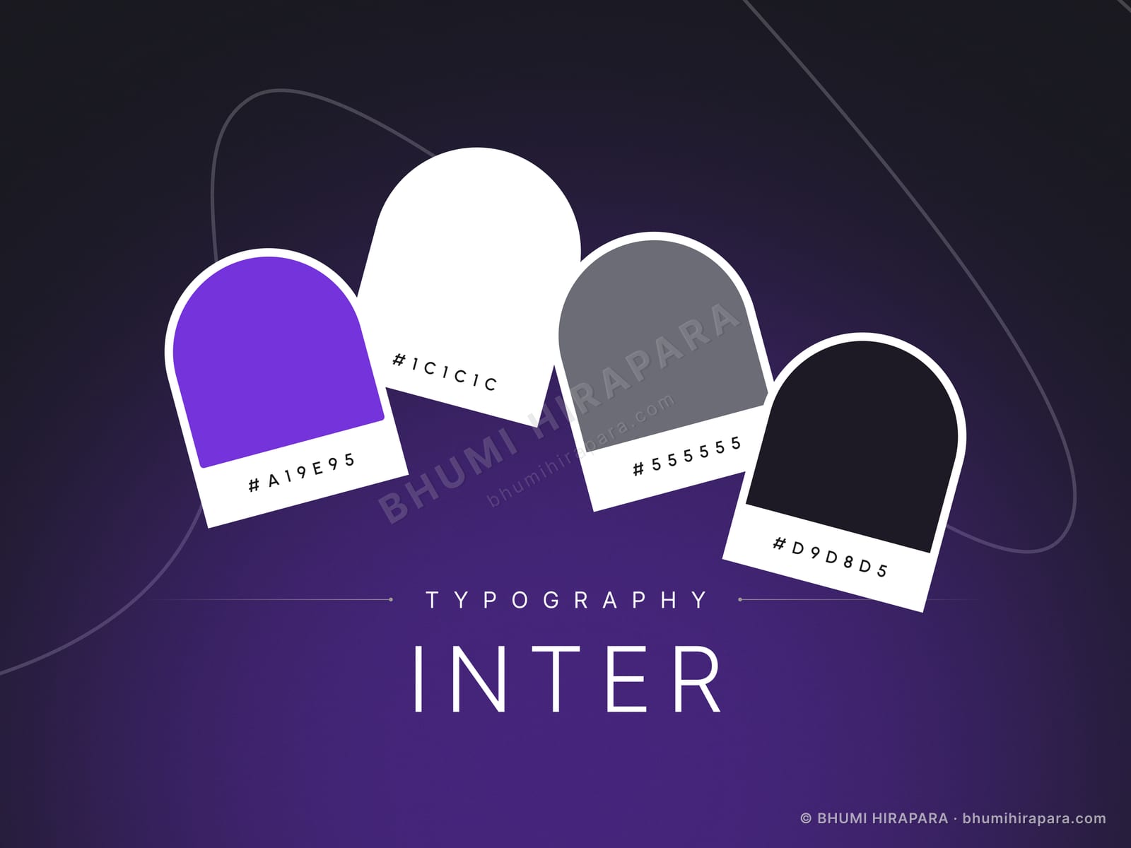
That pushed the surface to a dark neutral with generous spacing and consistent corner radii, so wildly different outputs sit together without clashing. Labels sit outside the image rather than over it, because text over an unpredictable image is text you cannot guarantee is readable.
Token usage belongs on the dashboard
Most products treat usage as an administrative concern and file it under billing. On AI products the cost is variable, per-action and genuinely uncertain, so people check it the way they check a fuel gauge.
Splitting the chart by model makes the comparison concrete rather than abstract. A user deciding between models wants to see the difference in their own usage, not read documentation about pricing tiers.
Three primitives, equally weighted
The temptation with a feature-rich product is to rank the entry points, which quietly tells users that two of the three are secondary. Here draft, image and agent are given identical visual weight because which one matters depends entirely on who logged in.
This also leaves room to add a fourth primitive later without rebalancing the whole screen, which is the sort of decision that determines whether a design survives its first year of roadmap.