Step 01
Map
Define the core journeys and what the user needs at each step.


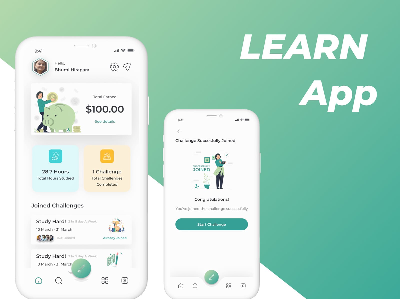
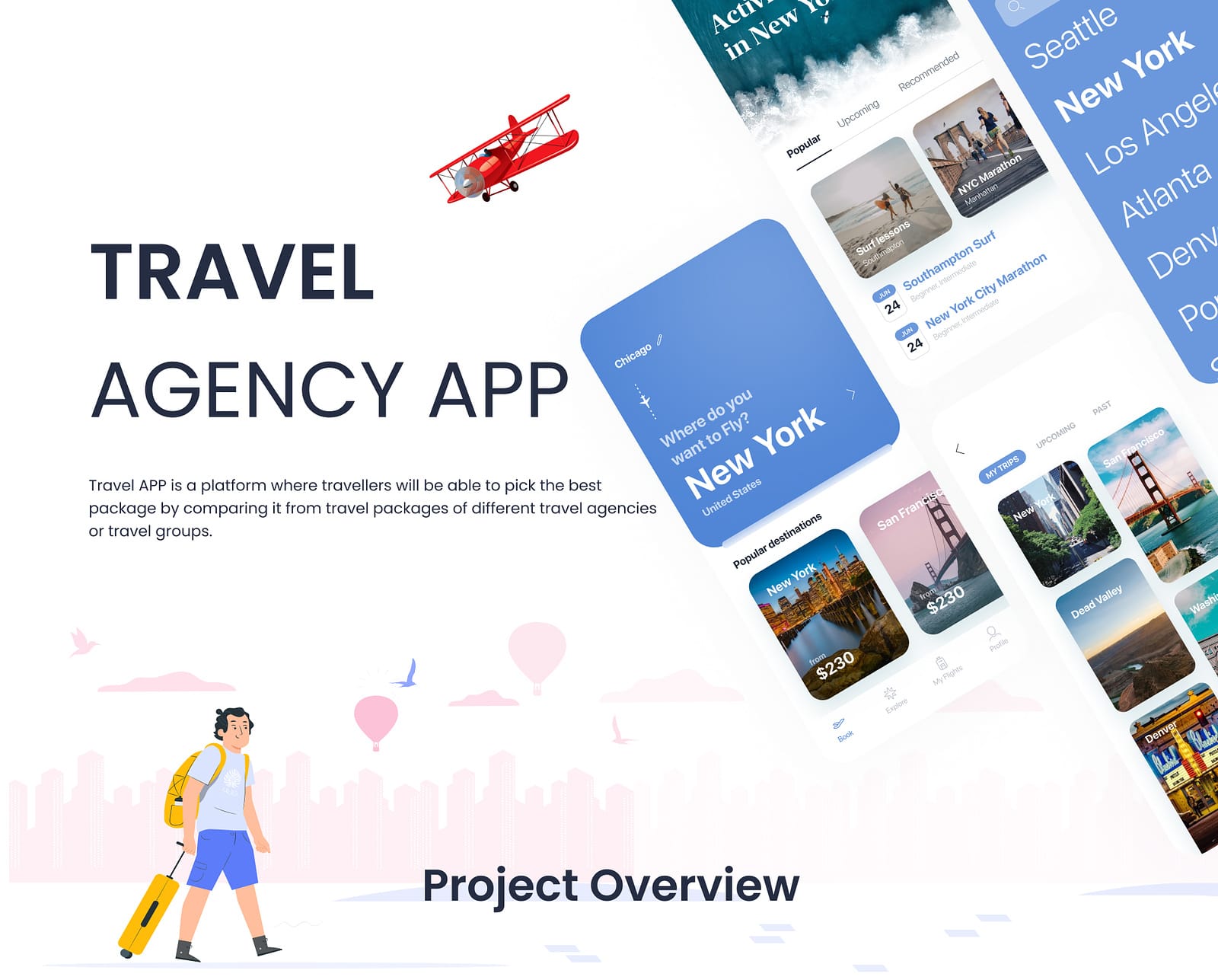
App interfaces built for thumbs, not just screens.
User-centred mobile app design for iOS and Android - navigation, screen states, component libraries and micro-interactions that make an app feel effortless.
Mobile design has less room and more constraints than the web, so every screen has to earn its place. I focus on making the primary action obvious and the navigation predictable.
I design against real platform conventions for iOS and Android rather than forcing one layout onto both, and I cover the states teams often forget: empty, loading, error and success.
Deliverables include a component library so your team can build new screens later without the design drifting.
A phone is held in one hand, often while walking, often in bad light, usually while distracted. That reality drives the design: primary actions sit where a thumb naturally lands, tap targets are large enough to hit without precision, and the interface never depends on hover.
It also means restraint. Every element competing for attention on a small screen makes the important one harder to find, so a good mobile screen usually does one job well rather than three jobs adequately.
Users form expectations from the other apps on their phone. Navigation patterns, typography, controls, gestures and system behaviours differ between platforms, and ignoring that makes an app feel subtly wrong even when users cannot articulate why.
I design with each platform in mind rather than shipping one identical layout to both. Where budget requires a single shared design, I make that trade-off explicitly and choose the compromises deliberately.
Every screen has more than one state, and the ones that get skipped are the ones users hit on their worst day: the empty state before any data exists, the loading state on a slow connection, the error state when something fails, the success state that confirms it worked.
These are designed as part of the screen set, not added later. Covering them properly is one of the most reliable ways to make an app feel finished rather than rushed.
A clickable prototype of the core journeys, the full high-fidelity screen set including edge cases, a component library covering every state, and exported assets at the densities iOS and Android require.
I also document the intended motion and transitions, because how a screen arrives affects how the app feels as much as how it looks when static.
Yes. I design for both platforms and respect the conventions each one has for navigation, typography and controls, rather than shipping one identical layout to both.
Yes, and that is a common request. I start with an audit of the current app to find where users drop off or get confused, then redesign around those specific problems instead of restyling everything.
A focused MVP is typically 15 to 25 unique screens once states are included. A mature product with accounts, settings and payments is often 40 or more. I scope by unique screens and states rather than by feature list, because that is what drives the work.
Yes - exported assets at the densities iOS and Android require, a documented component library covering every state, and annotated specs for spacing, type and motion.
How a mobile app design engagement actually runs, start to finish.
Define the core journeys and what the user needs at each step.
Build a clickable flow to test navigation before visual design.
Produce the full screen set including edge cases and states.
Deliver the component library, specs and exportable assets.


Full Time Contract Available. Tell me about your project, your timeline and your budget, and I’ll reply with an approach and a rate.
Start a project