

- ClientConfidential
- Year2023
- RoleMobile App Designer
- CategoryMobile App Design
The challenge
Learners were starting courses and abandoning them within the first few sessions. The app had plenty of content and no shortage of features, but it gave almost no sense of progress - a learner finishing a lesson saw no indication of where that sat in a larger journey, and nothing pulled them back the next day.
What I did
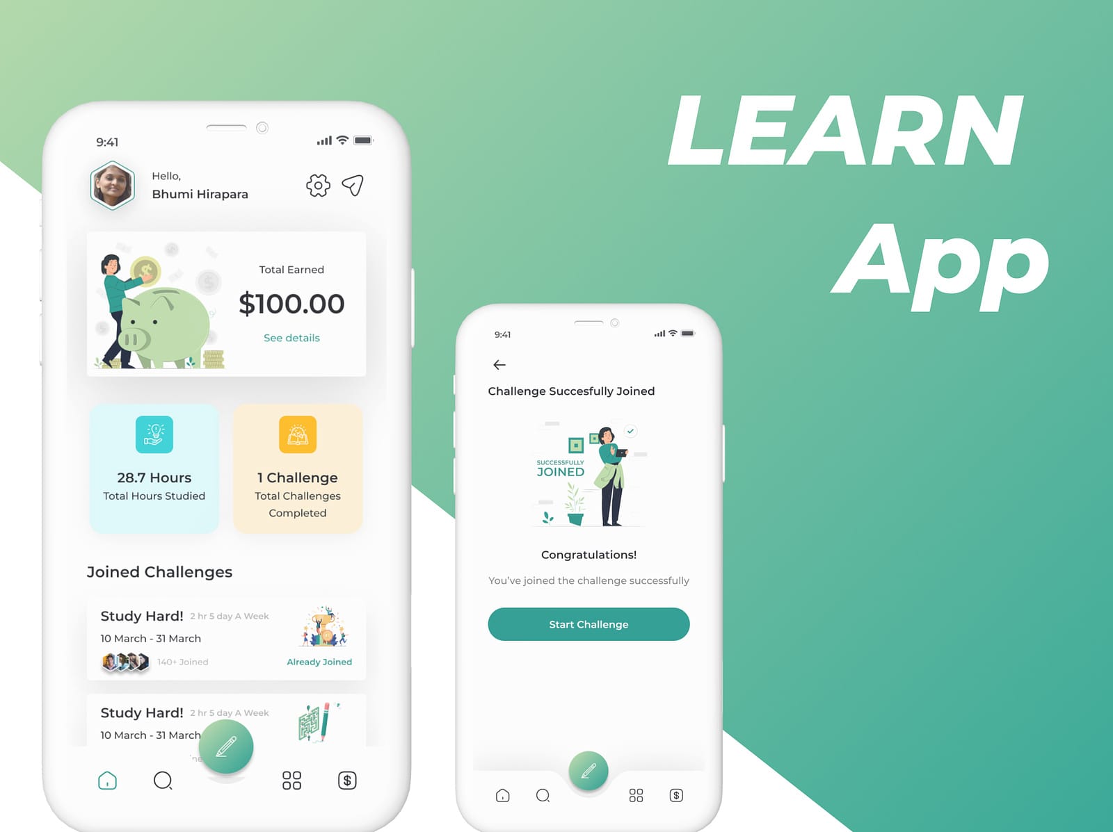
I redesigned the experience around a visible study path. Progress appears on every screen rather than hidden in a profile tab, so a learner always knows where they are and what comes next. Lessons were broken into smaller units so a session can be completed in a realistic gap of time, and the first reward now arrives early enough to establish a habit rather than after a wall of effort. Navigation was simplified so resuming a course takes a single tap from launch.
The outcome
A learning flow that always answers "what do I do next", with progress and streaks placed where they motivate. The redesign reframed the product from a content library into a guided path, which is the difference between a resource learners visit occasionally and a product they return to daily.
Progress is the product
For a learning app, the content is the raw material but progress is the product. Learners persist because they can see themselves advancing, not because more material exists.
That reframing drove nearly every decision: chunk lessons so completion is achievable, show the path at all times, mark what is done, and make the next step obvious before the learner has to think about it.
Designing the first session
Most abandonment happens in the first two sessions, so those got designed specifically rather than treated as the generic case. The first session reaches a completed unit and a first reward quickly, which establishes the pattern the rest of the app depends on.
A learner who finishes something on day one has a reason to come back on day two. A learner who only browsed does not.
Reducing the cost of returning
Every tap between opening the app and resuming study is an opportunity to give up. Resuming was reduced to one tap from launch, with the active course surfaced immediately rather than requiring navigation back through a catalogue.