

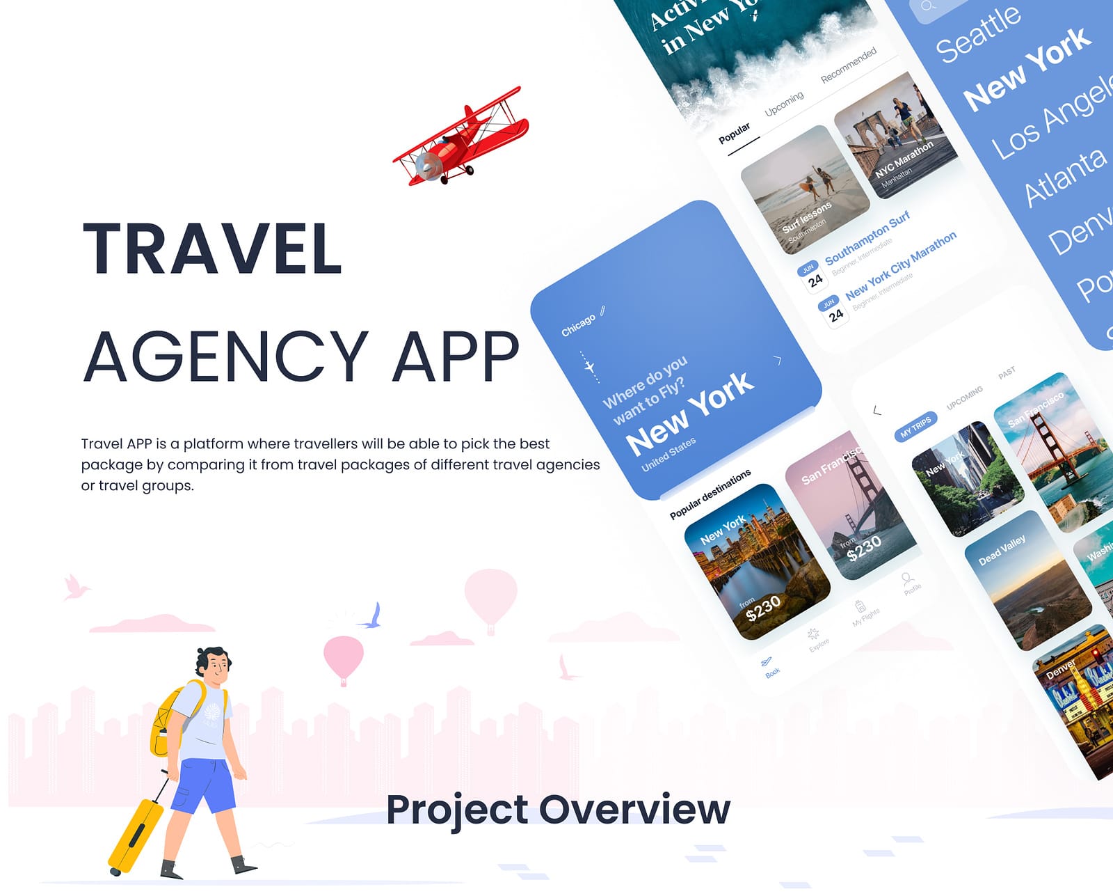
- ClientConfidential
- Year2023
- RoleMobile App Designer
- CategoryMobile App Design
The challenge
Travel packages are genuinely hard to compare. Every agency presents them differently - some quote per person, some per couple, some include transfers and some do not, and inclusions are written as marketing prose rather than structured data. Users were opening several listings in separate tabs, scrolling back and forth, and still could not confidently say which was the better deal.
What I did
The core of the redesign was a normalised comparison view. Every package is presented in the same shape, so price, duration, inclusions and exclusions line up row by row and differences become visible at a glance rather than requiring interpretation. Filters were cut back to the few that genuinely change a decision, since a long filter panel mostly adds work. Saved comparisons let a user step away and return, which matches how people actually book travel - rarely in one sitting.
The outcome
A comparison experience that makes the differences between packages obvious at a glance, replacing tab-juggling with a single scannable view, and supporting the multi-session way people really make travel decisions.
Normalising the unstructured
The hard problem was not layout, it was that source data arrived in inconsistent shapes. The design had to define a common structure - what counts as an inclusion, how price is expressed, how duration is measured - and then present every package through it.
Design work like this is really information design. Once the structure was agreed, the interface became straightforward.
Fewer filters, better filters
The instinct on a comparison product is to expose every filter available. In testing, long filter panels mostly produced abandonment - people do not want to specify their preferences in advance, they want to see options and react.
Cutting to the few filters that genuinely change the decision made the product faster to use and easier to understand.
Designing for multi-session decisions
Nobody books a holiday in one sitting. They browse, discuss it with someone, and come back. An interface that forgets everything between sessions forces the research to be redone.
Saved comparisons and persistent state were designed in from the start rather than treated as a nice-to-have.