

- ClientZorro
- Year2022
- RoleUI/UX Designer
- CategoryProduct Design
The challenge
The product served two audiences with almost nothing in common: advertisers placing and managing campaigns, and users browsing what had been placed. Both were being served by a single interface, which meant each group waded through controls meant for the other. Advertisers found the campaign tools buried among browsing features; users met advertiser terminology they had no reason to understand.
What I did
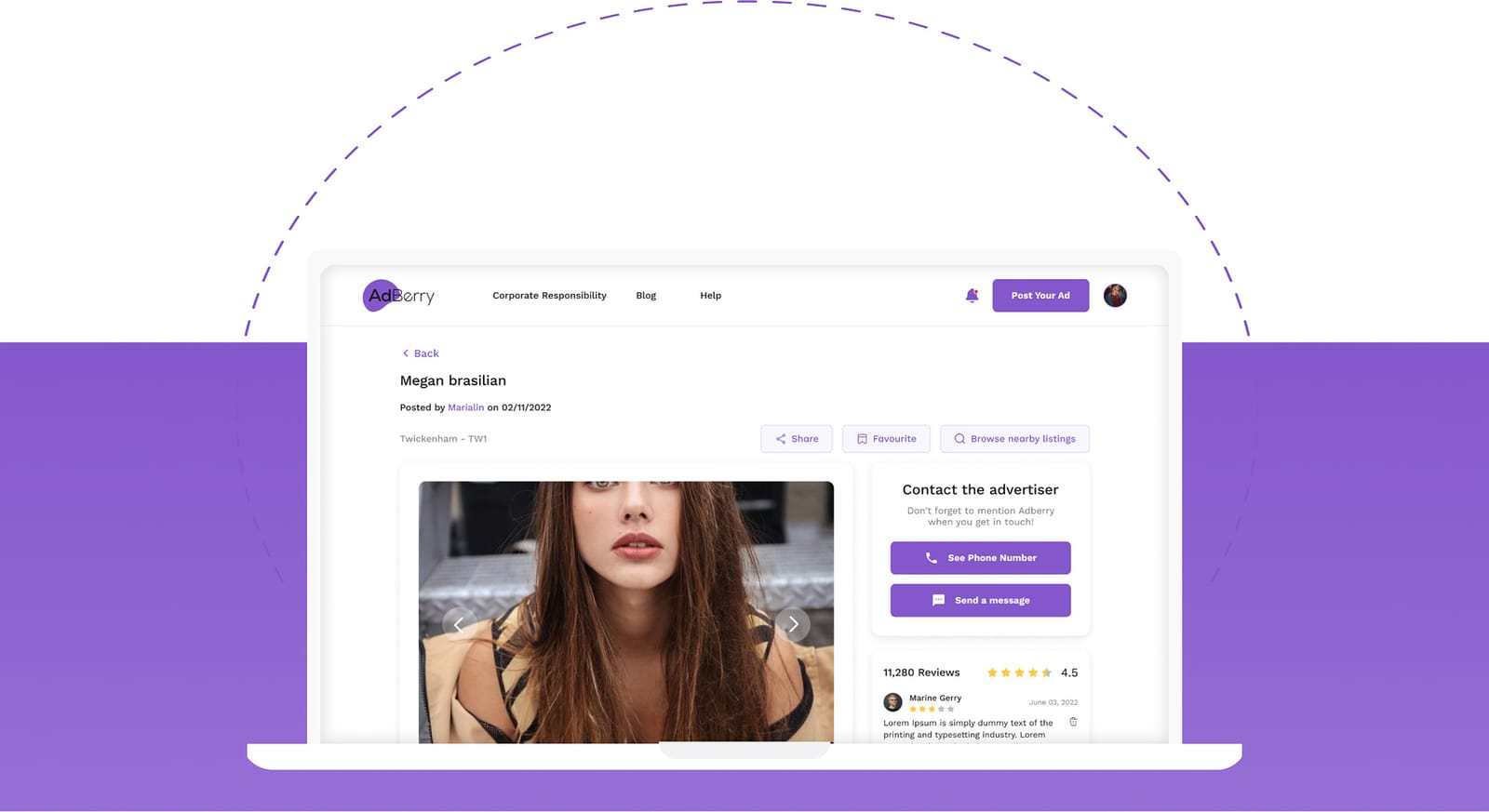
I split the experience into two purpose-built surfaces sharing one design system. Advertisers get a focused campaign builder organised around the task of getting a campaign live. Users get a fast, filter-led browsing experience with no advertiser concepts exposed at all. A shared component library keeps both feeling like one product, and means the team ships a change once rather than twice.
The outcome
Two distinct interfaces that each do one job well, built on a shared component library so the team can evolve both without the designs drifting apart - the usual failure mode when two surfaces are maintained separately.
When one interface serves two audiences
Merging audiences into one interface is usually a decision made for build economy rather than user benefit, and the cost lands on everyone. Each group pays attention tax on features meant for the other.
Splitting the surfaces while sharing the underlying system gets most of the build economy back without asking either audience to tolerate the other's tools.
A design system as the bridge
The risk when you split an interface is divergence: six months later the two halves look like different products. The design system exists to prevent that.
Type scale, colour, spacing, form controls, buttons and feedback patterns are defined once and used by both surfaces. What differs is composition and vocabulary, not the raw material.
Designing the campaign builder
The advertiser side is the more complex surface: a multi-step task with real consequences if it goes wrong. It was designed as a guided flow with the state of the campaign always visible, clear validation before spending money, and the ability to save and return.
Users browsing, by contrast, needed speed above all - minimal chrome, fast filtering and quick scanning.