- ClientKite Cyber
- Year2025
- RoleUI/UX & Web Designer
- CategoryWeb Design
The challenge
Security products either read as dense and technical or as vague and salesy. This one needed to explain a genuinely technical idea - discovering unsanctioned SaaS and cloud APIs and securing them with an AI co-pilot - to a buyer who is busy and sceptical, without drowning them in jargon.
What I did
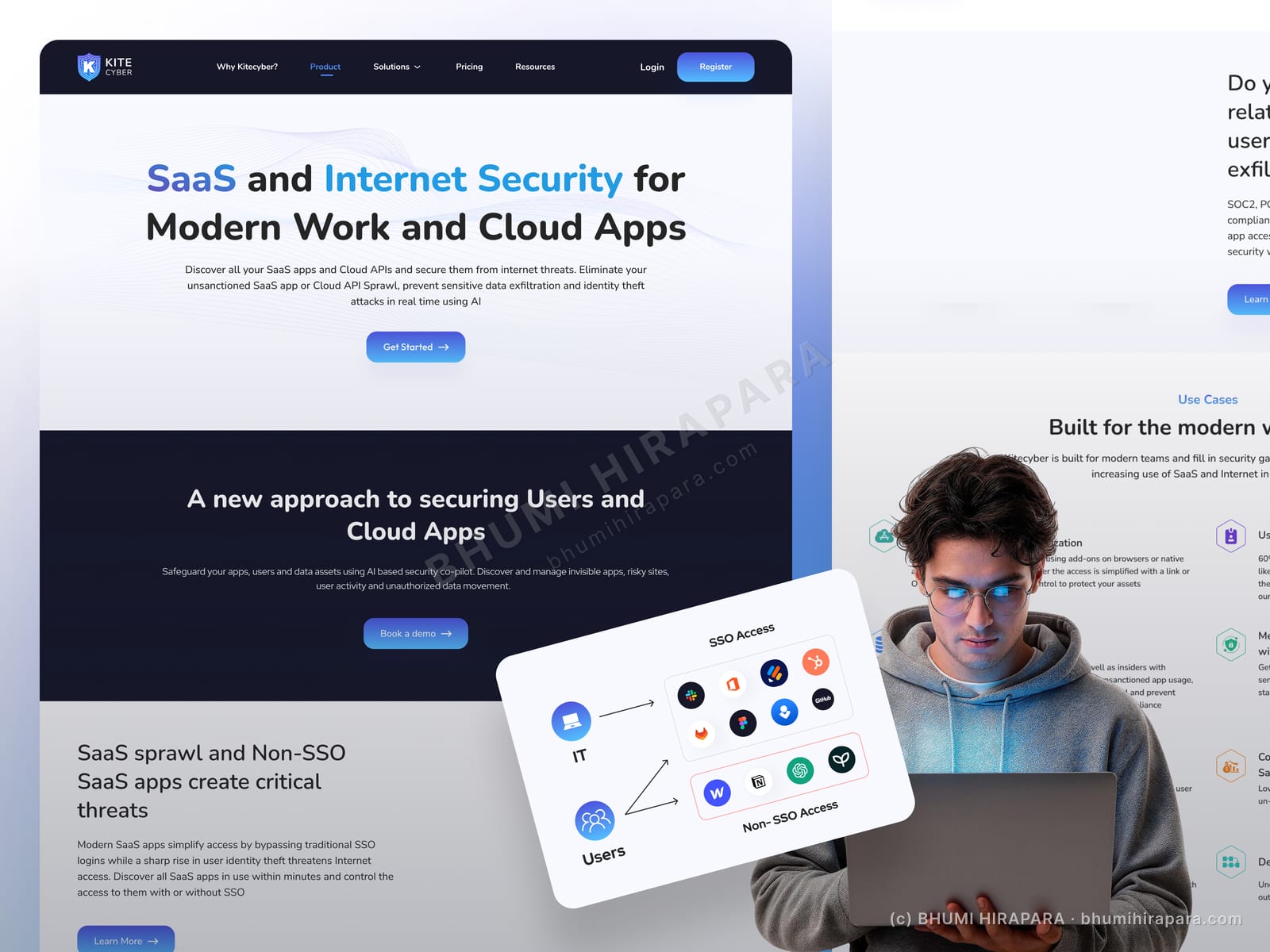
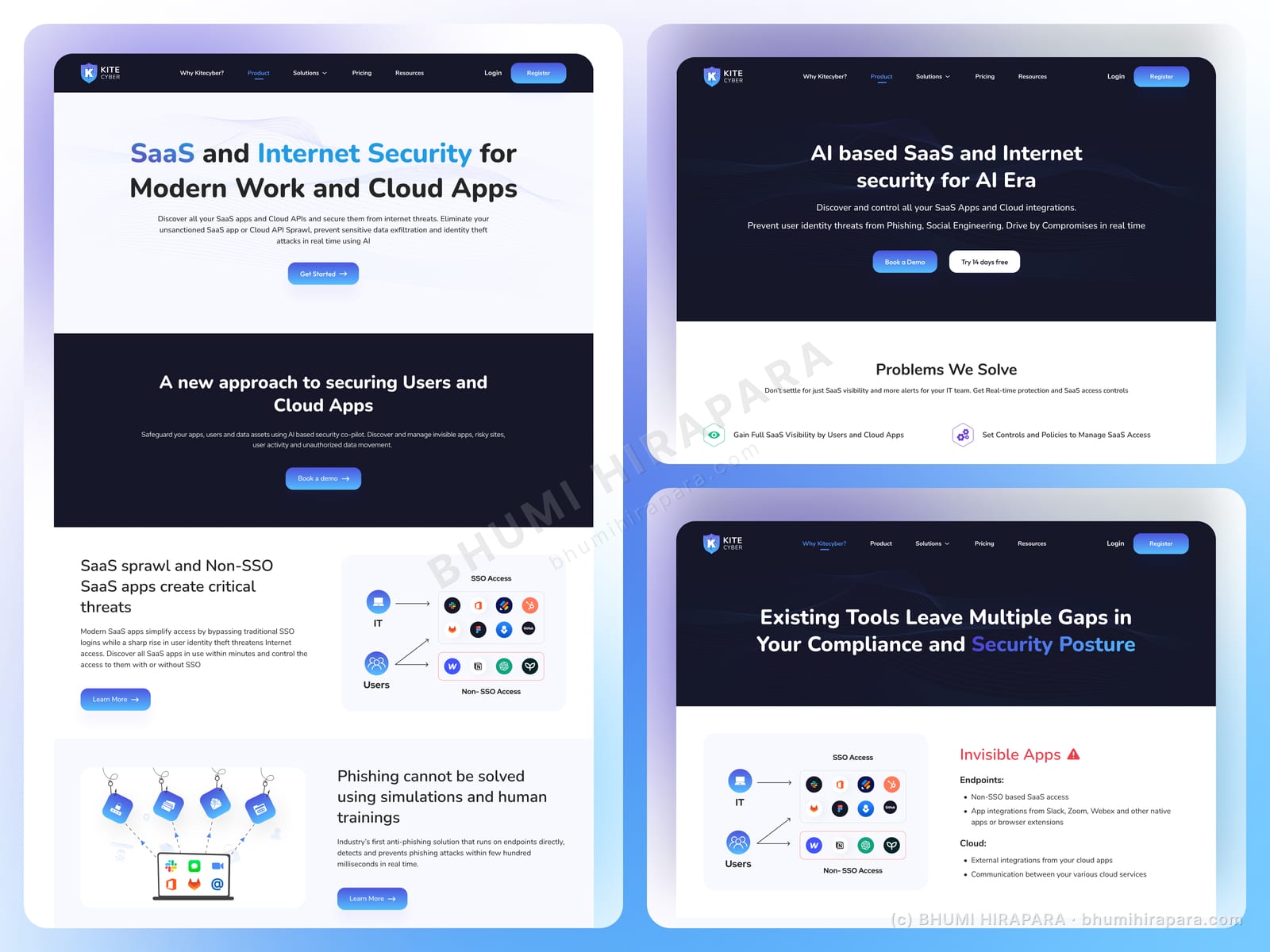
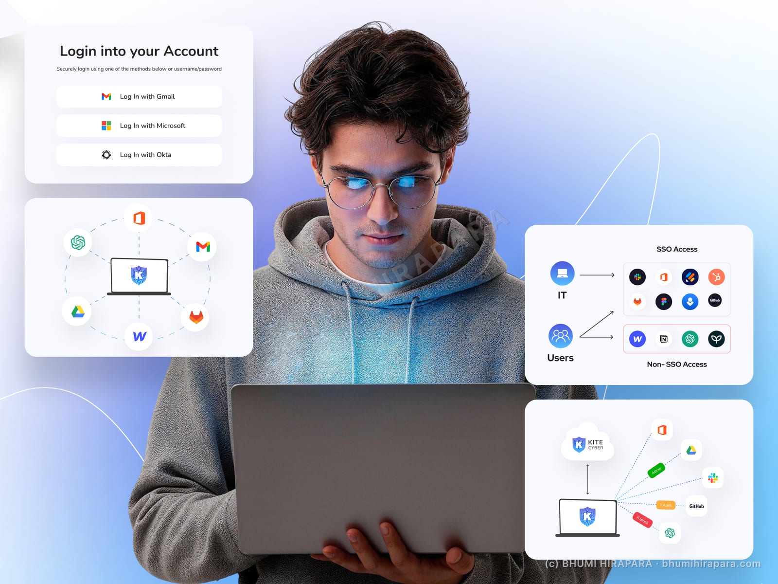
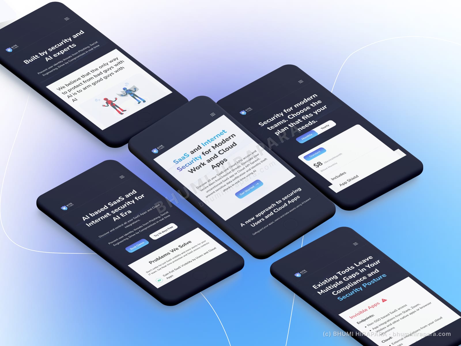
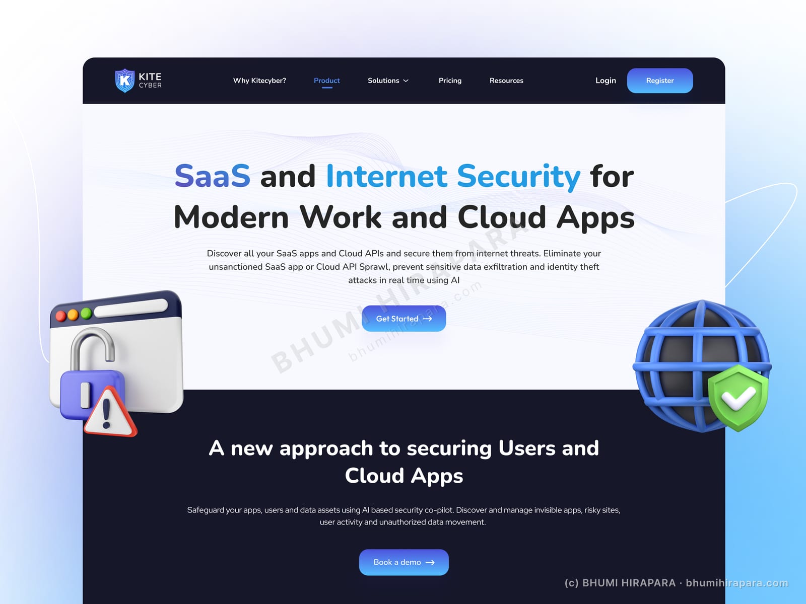
I led with the outcome in plain language and let a calm dark-navy palette, generous spacing and a few 3D security motifs carry the trust signal. The page steps from the problem (shadow apps, data risk) to the approach (an AI security co-pilot) to the proof, so a visitor understands what it does before they are asked to book a demo.
The outcome
A security marketing site that explains a technical product in clear steps, with a consistent component set for feature blocks, and a single obvious call to action to book a demo.
Explaining a technical product without jargon
The hardest part of a security site is saying what the product does in a sentence a non-engineer trusts. I wrote the hierarchy so the hero states the job, the next section states the approach, and only then does the page get into capabilities.
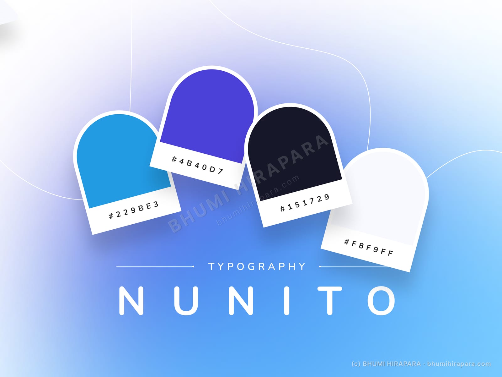
Dark backgrounds and restrained accent colour do the rest: they read as serious and secure without the page having to shout about it.
A component set for a product that will keep adding features
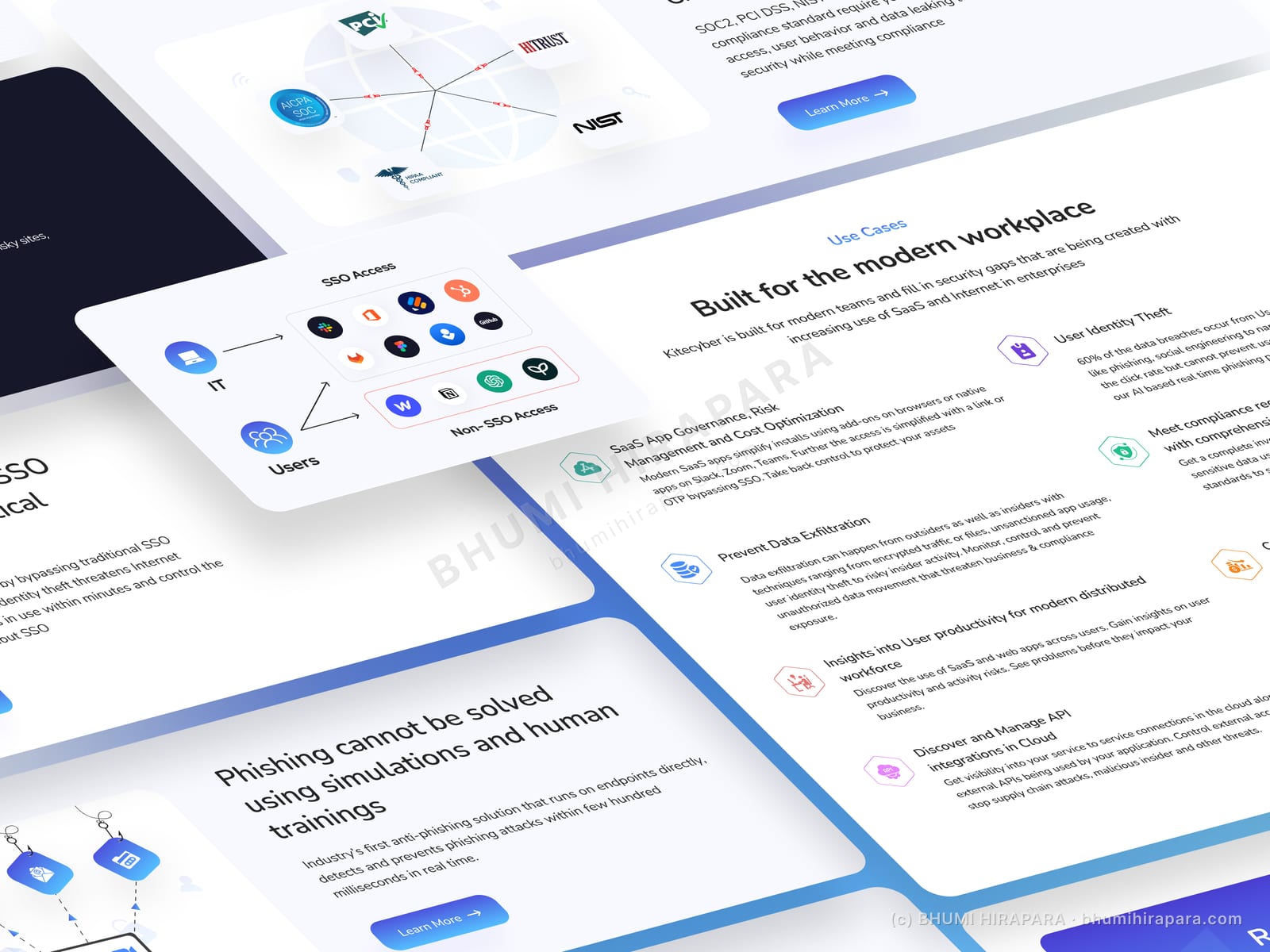
Security products ship new capabilities constantly. I built feature blocks, comparison rows and call-to-action bands as a reusable set so the team can add a capability without the page drifting out of style.