- Client3P Experience
- Year2025
- RoleUI/UX & Web Designer
- CategoryWeb Design
The challenge
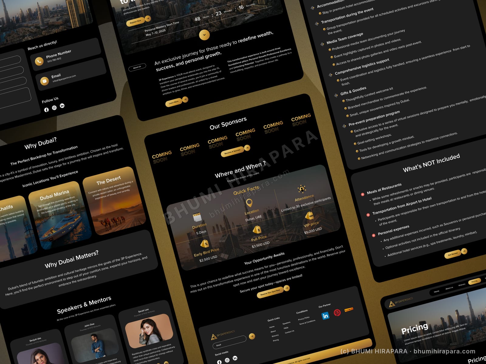
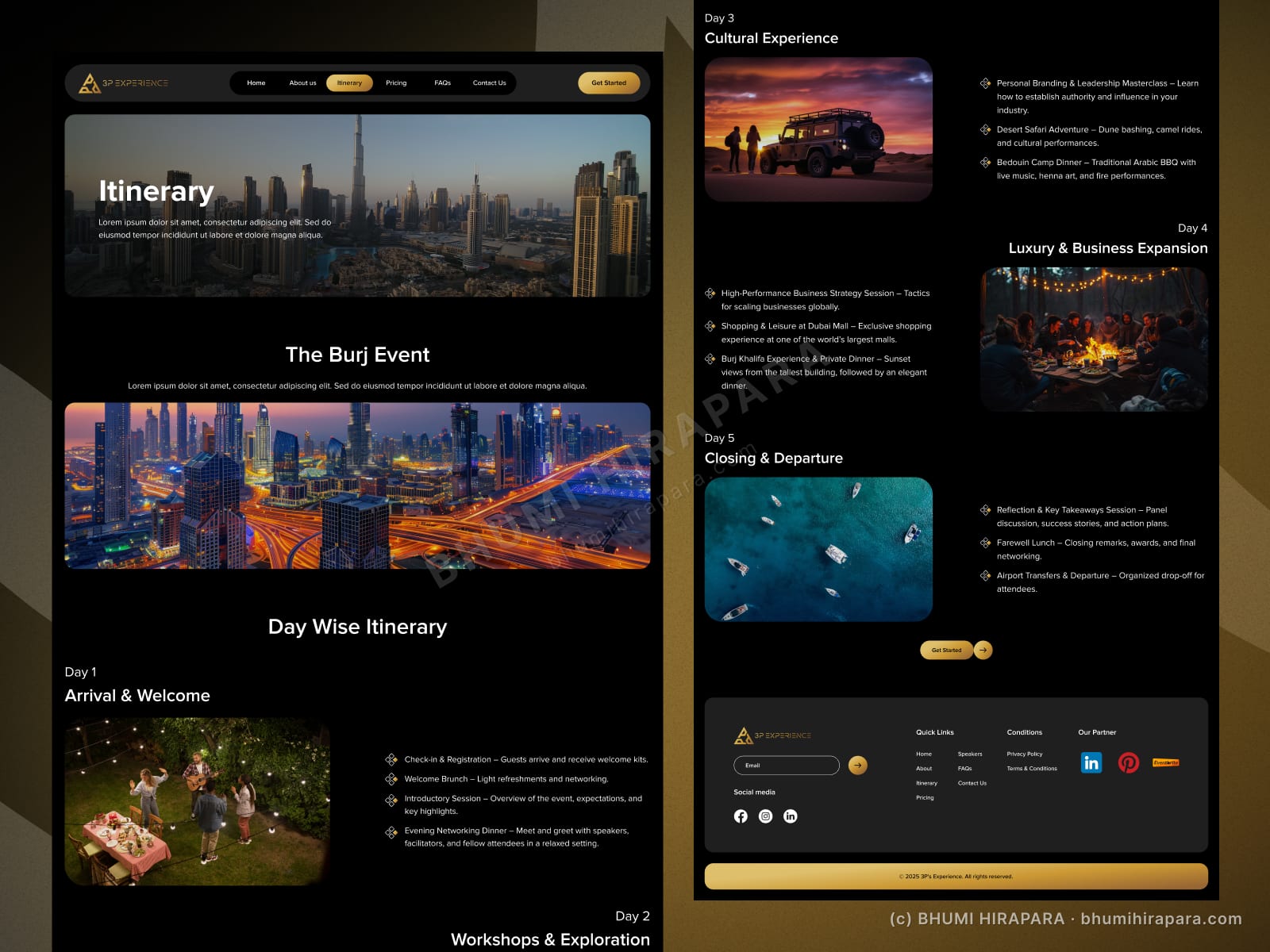
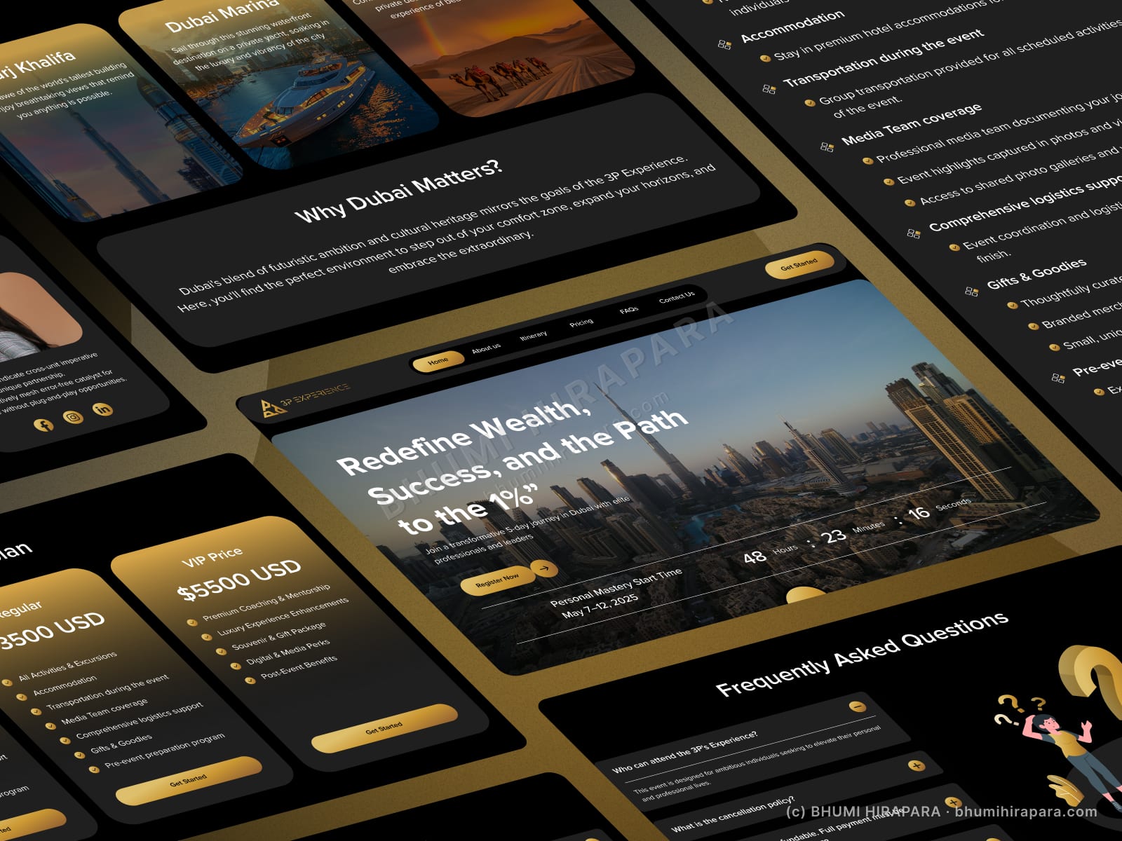
A high-ticket event has to look worth the money before anyone reads the price. The site needed to communicate exclusivity and a clear itinerary while making three pricing tiers easy to compare and book.
What I did
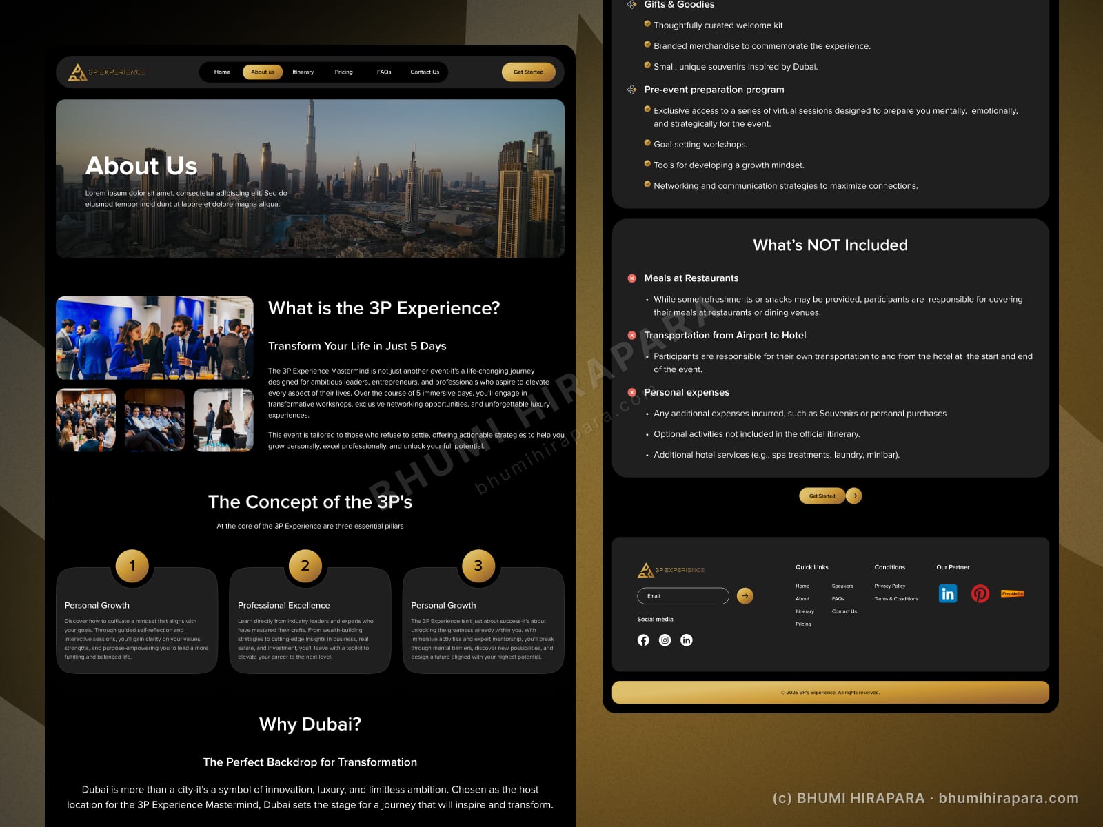
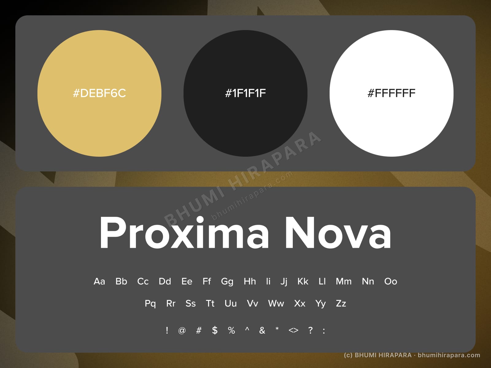
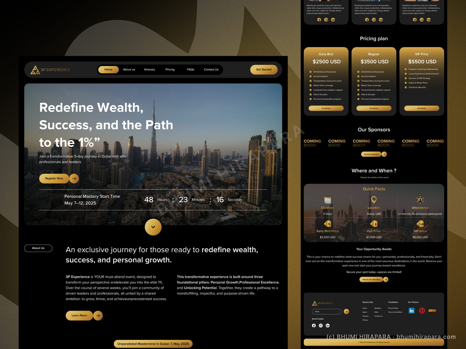
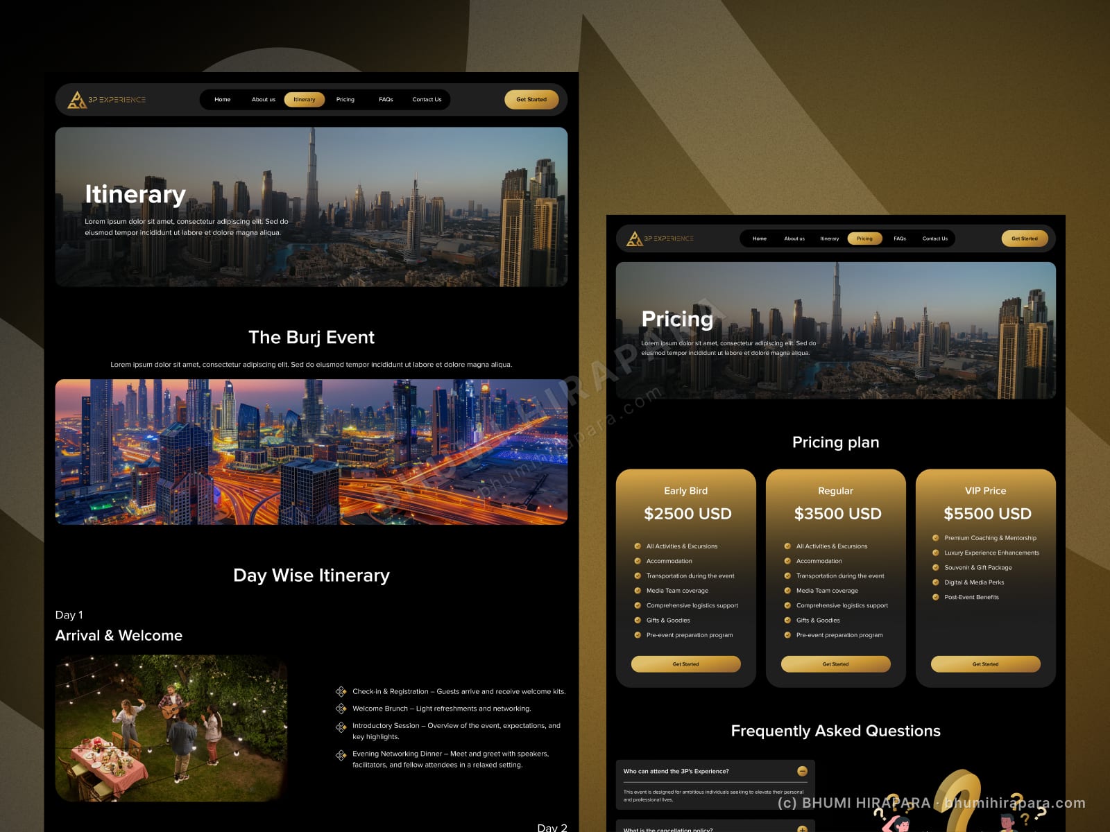
I used a gold-and-black palette and full-bleed city photography to set the luxury tone, then structured the content as a story: the experience, the day-wise itinerary, the pricing tiers side by side, and an FAQ to remove last-minute doubt. The three tiers are laid out as scannable cards so the decision is quick.
The outcome
An event site that feels as premium as the ticket, with a clear itinerary, comparable pricing tiers and an FAQ that answers the obvious objections before they stop a booking.
Luxury is mostly restraint
The gold accents only work because the rest is dark and quiet. I kept type large and spacing generous so the photography and the few metallic touches carry the premium feel, rather than decorating every element.
Making three price tiers an easy decision
Pricing is where high-ticket events lose people. The three tiers sit side by side with matched feature rows, so the comparison takes seconds and the most popular option is visually anchored.