- ClientArtistry Music
- Year2025
- RoleUI/UX & Web Designer
- CategoryWeb Design
The challenge
A music school competes with faceless course marketplaces. It needed a site that felt human and culturally grounded, made the course range easy to understand, and turned interest into a class enquiry.
What I did
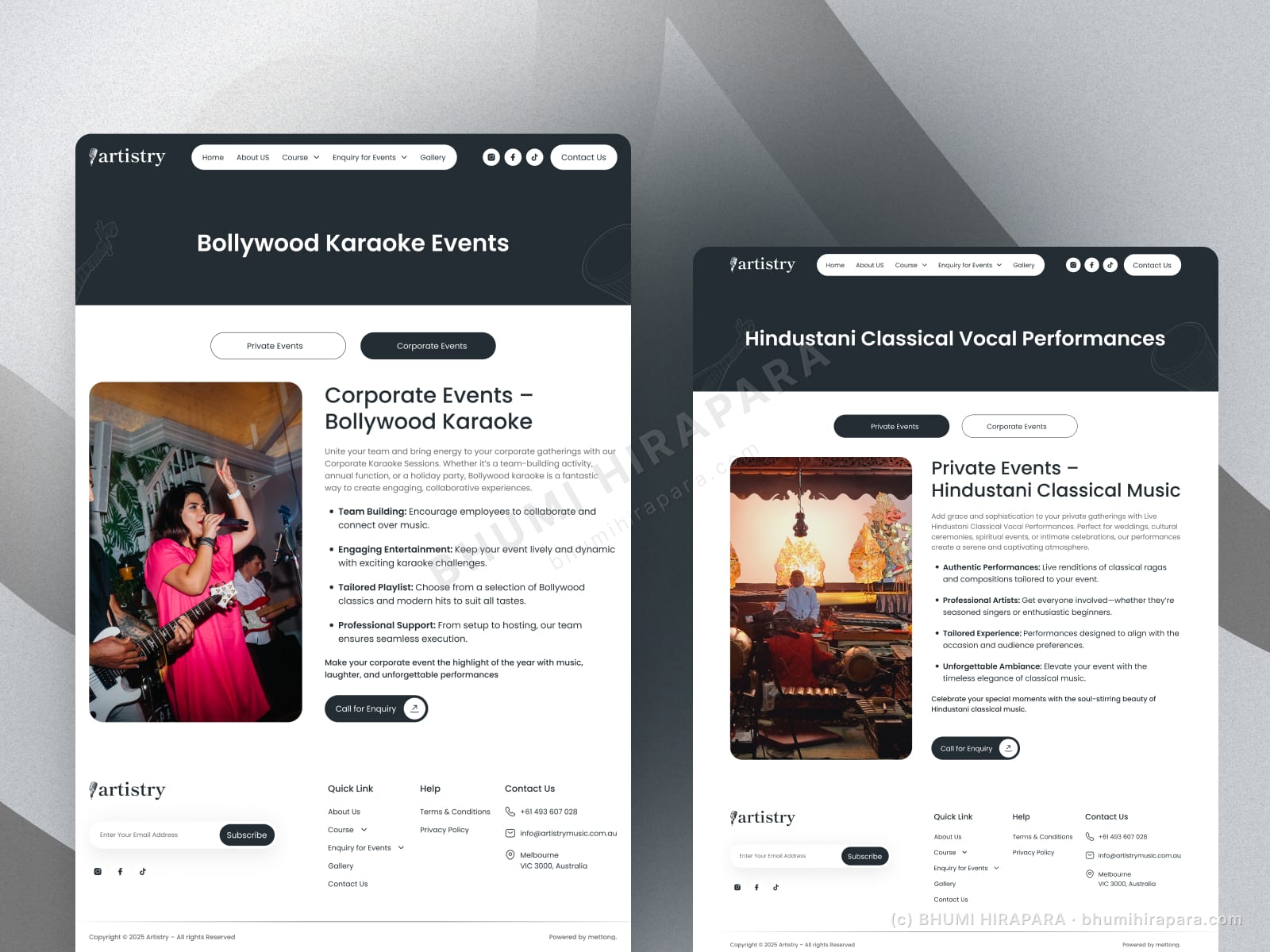
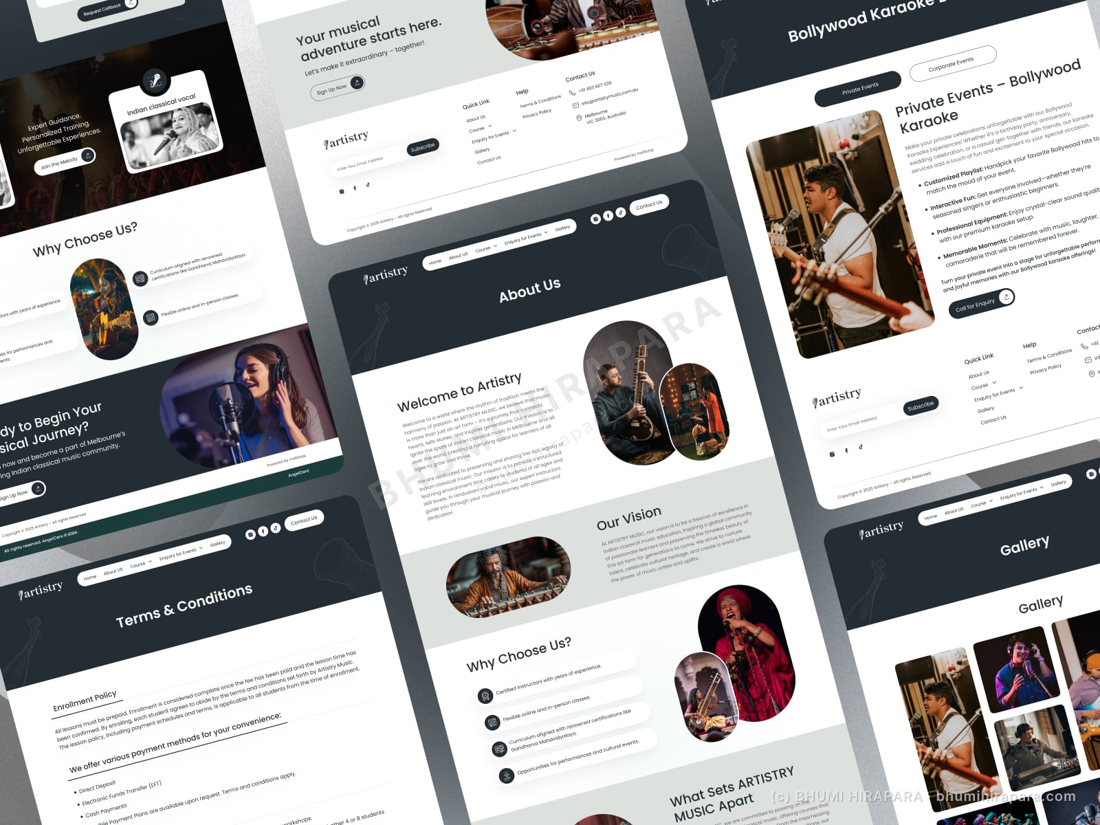
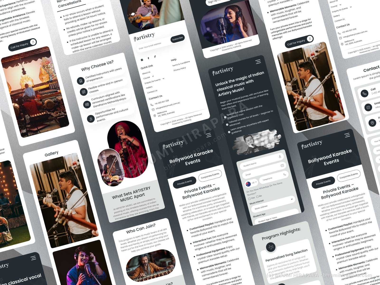
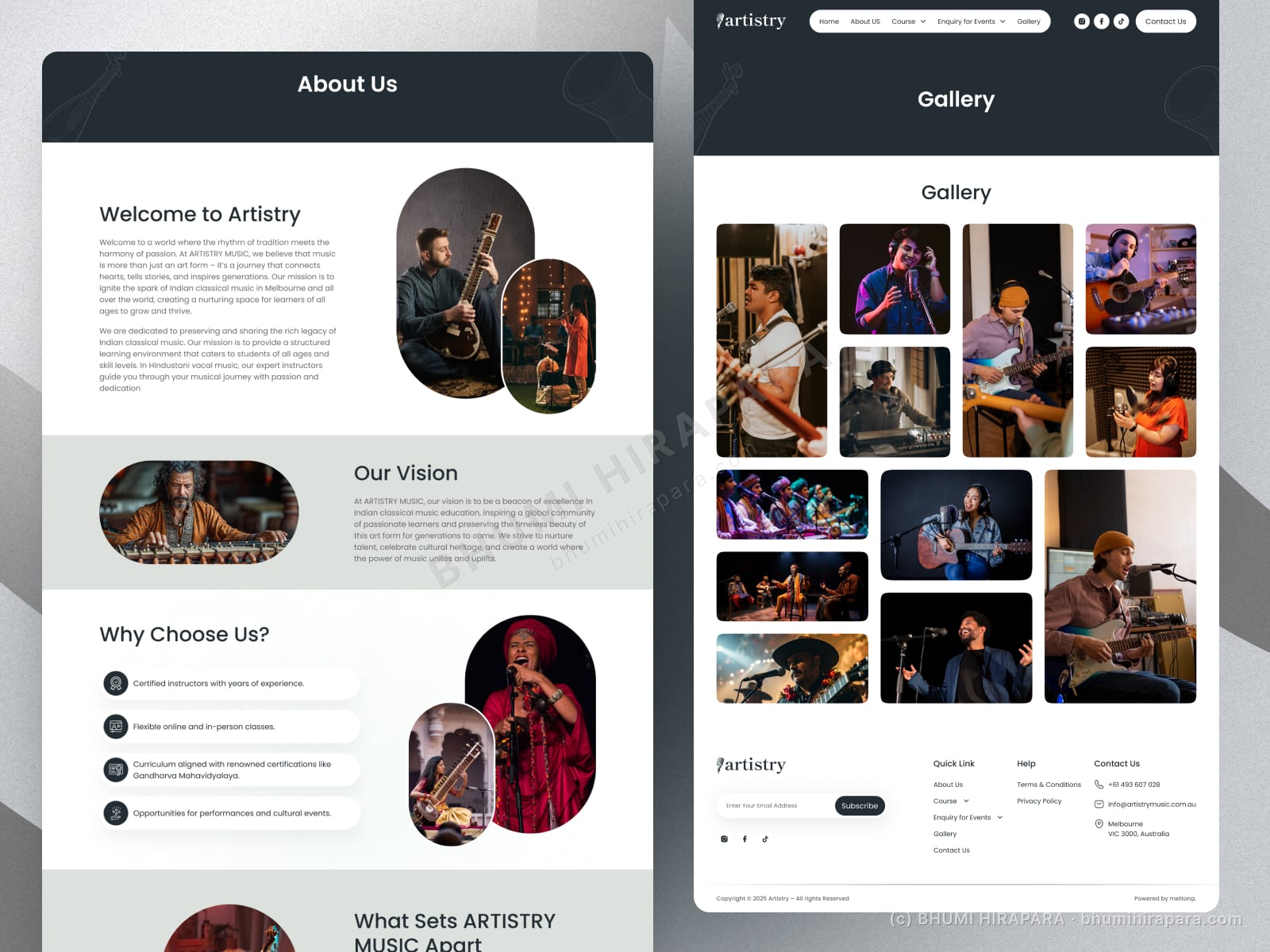
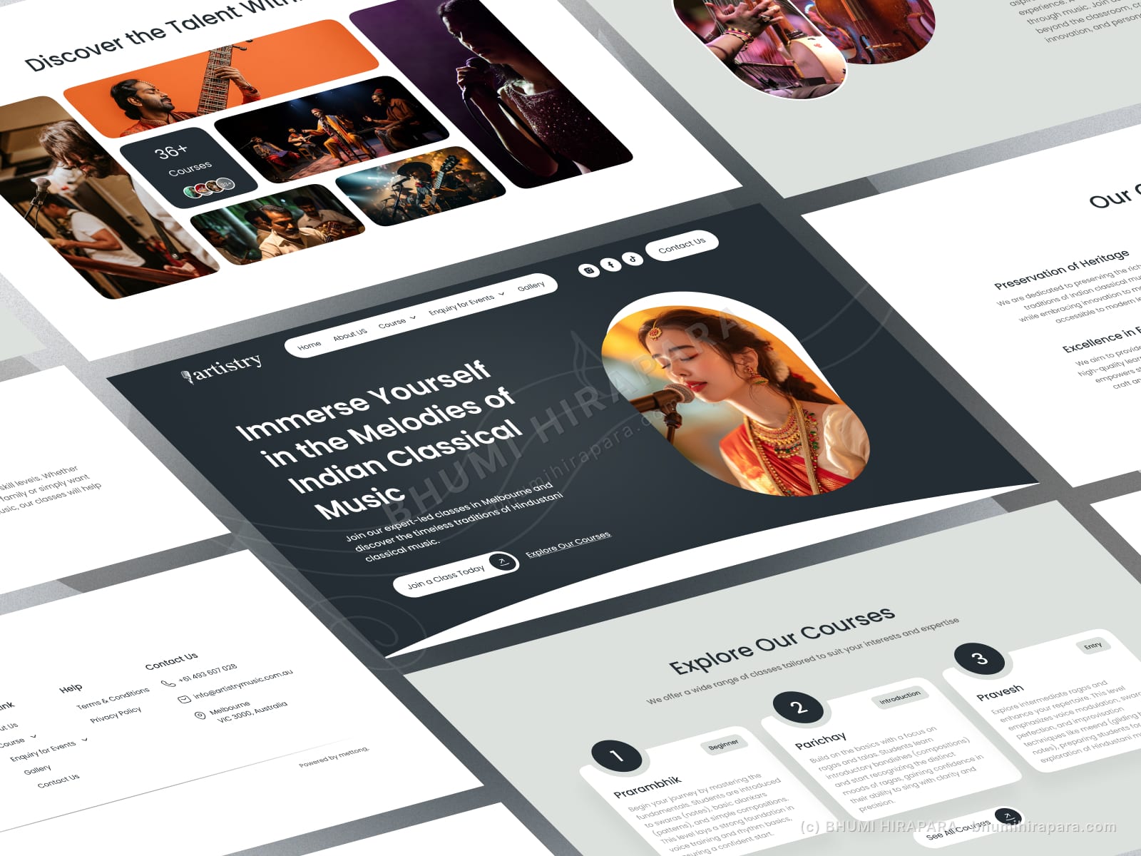
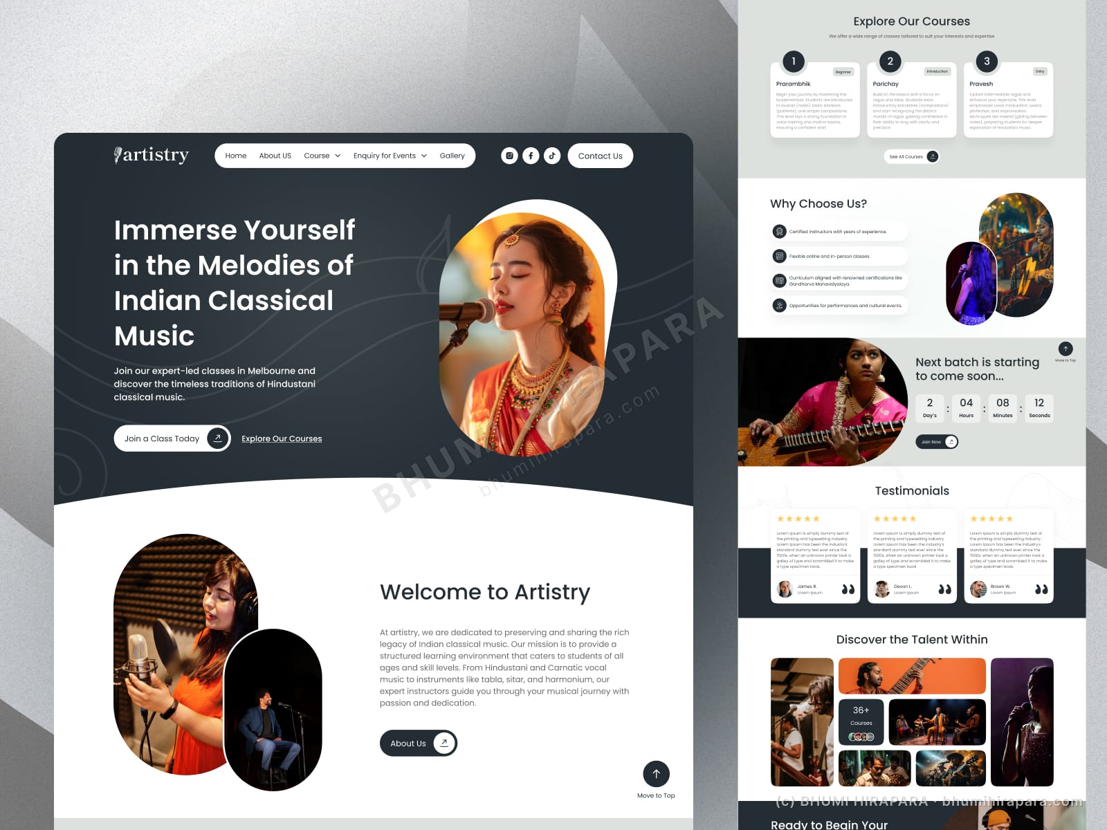
I built the site around photography of real performance and teaching, with a clean editorial layout so the courses and levels are easy to scan. Testimonials and an upcoming-batch countdown add urgency, and a single "join a class" action runs through the page.
The outcome
A warm, content-led site that presents courses and levels clearly, uses real imagery to build trust, and points everything at one enquiry action.
Human, not a course marketplace
The difference between a school and a marketplace is personality. Real photography of teaching and performance, plus an editorial layout, makes the school feel like people rather than a catalogue.
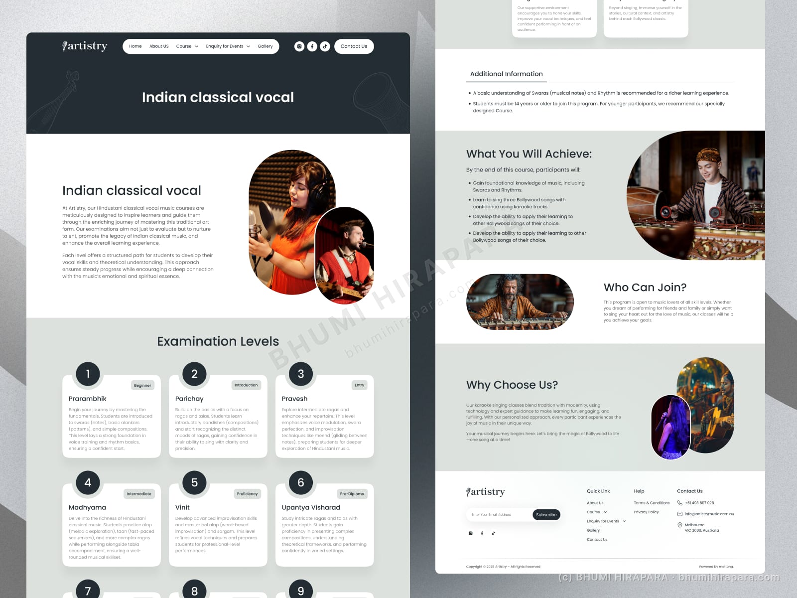
Courses and levels you can actually parse
Prospective students need to see where they fit. I structured courses by level with clear labels so a beginner and an advanced student both find their path quickly.