

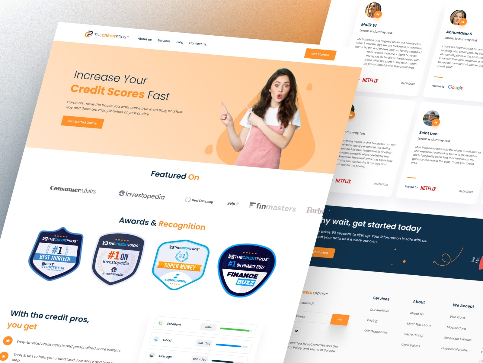
- ClientThe Credit Pros
- Year2024
- RoleUI/UX Designer
- CategoryWeb Design
The challenge
Financial services live or die on trust, and credit repair carries more scepticism than most. Visitors arrive stressed, often after a bad experience elsewhere, and they are scanning for reasons to disbelieve you. The existing site read like marketing: confident claims, little substance, and a service list that left visitors to work out for themselves which option applied to them.
What I did
I led with plain-language explanations of how the service actually works, including what it cannot do, on the principle that acknowledging limits reads as more credible than promising everything. Proof - credentials, real results, process transparency - was moved above the fold rather than parked on a separate page. The service list was replaced with a short selector that routes a visitor to the right offering in one step based on their situation. Typography and spacing were kept generous so that dense financial information stayed readable under stress.
The outcome
A site that explains a complex, distrusted service in plain terms, surfaces trust signals in the first screen, and gives each visitor a single obvious next step instead of a menu of options they are not equipped to choose between.
Designing for a sceptical reader
The usual conversion playbook - urgency, bold claims, social proof turned up loud - works against you in financial services. The visitor has likely already been sold to by someone less scrupulous.
So the design does the opposite: it slows down, explains the mechanism, states the limits, and shows evidence. Restraint reads as confidence here, and confidence is what the visitor is actually shopping for.
Routing instead of listing
A service list asks the visitor to diagnose themselves. Most cannot, so they either pick wrong or leave. Replacing the list with a short selector - a couple of plain questions about their situation - moves that work from the visitor to the interface.
It also gives the business better qualified enquiries, because the person arriving at the contact form has already been matched to the right service.
Readability as a trust signal
Financial content is dense by nature. Cramped type and tight line spacing make it feel harder than it is, and difficulty reads as evasion.
Generous spacing, a restrained type scale and short paragraphs were used throughout so the substance stayed accessible - particularly on mobile, where most of this audience arrives.