- ClientMeet Flow
- Year2026
- RoleUI/UX Designer
- CategorySaaS Product Design
The challenge
Recording tools tend to present themselves as an archive: a list of past meetings, newest first. That is fine once you have fifty recordings and useless on day one, when the product has to teach what it does and get the first recording started.
What I did
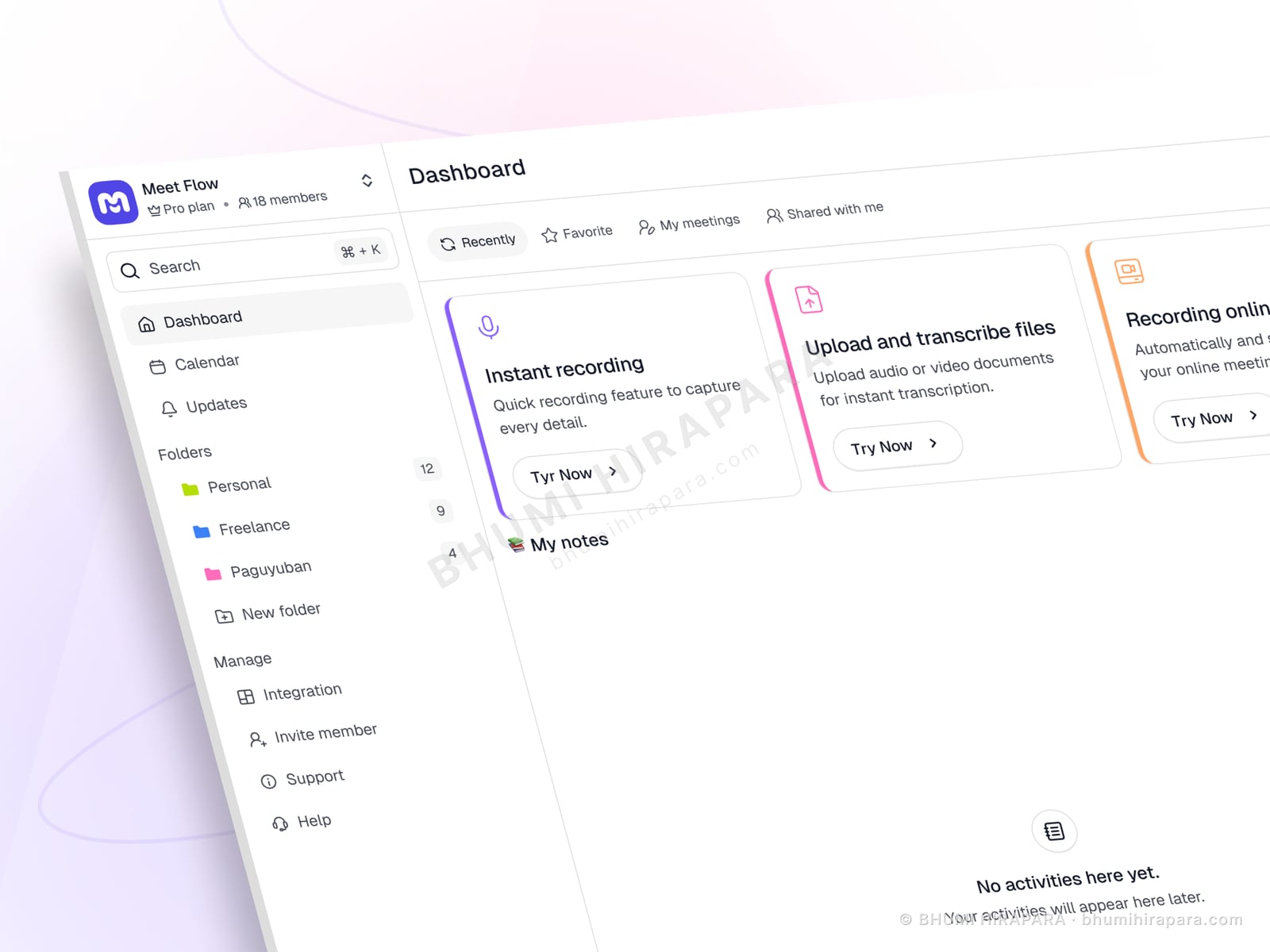
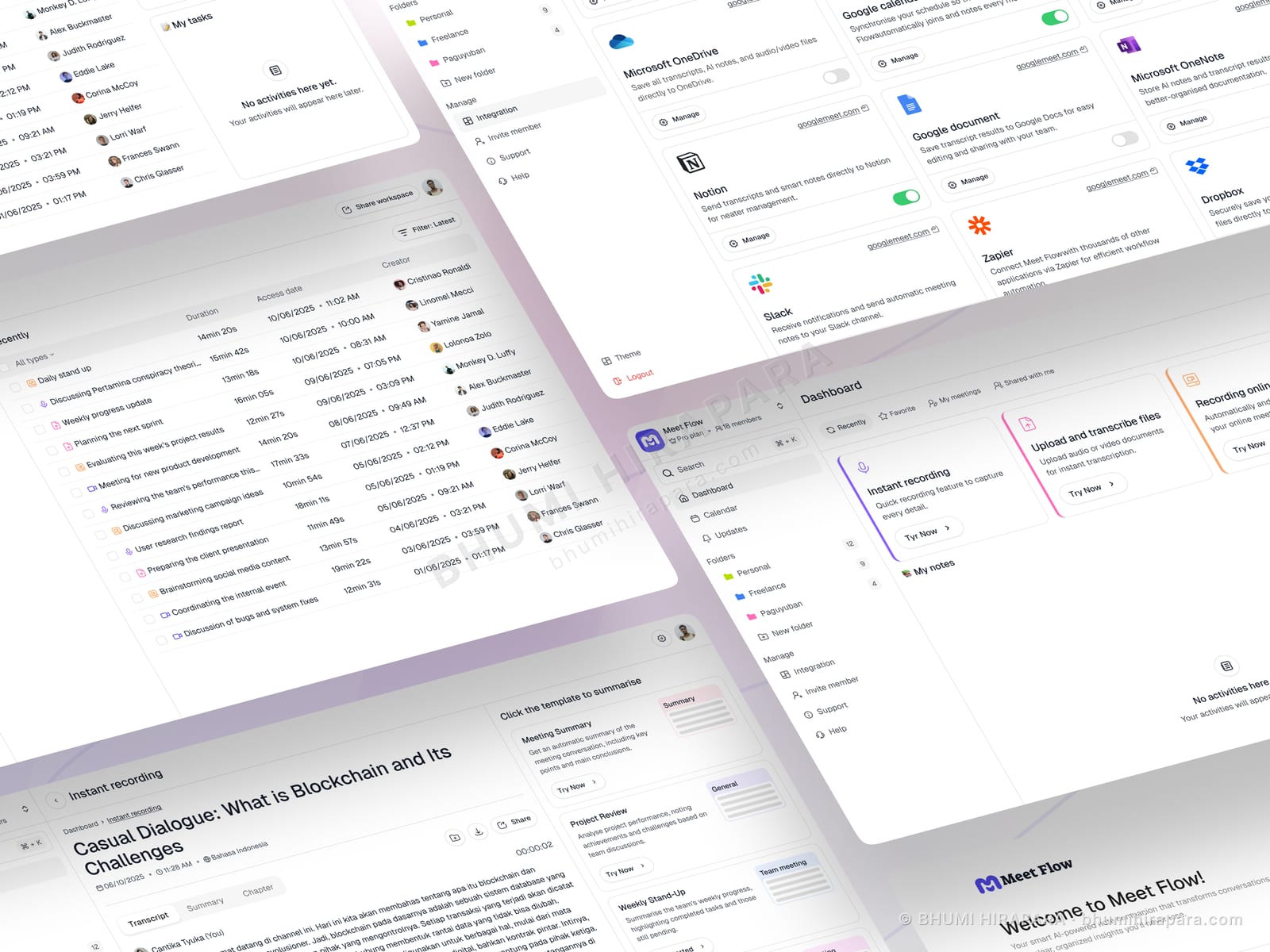
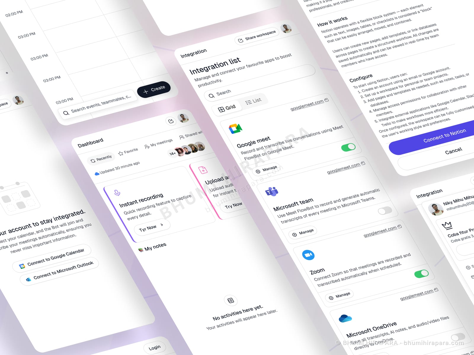
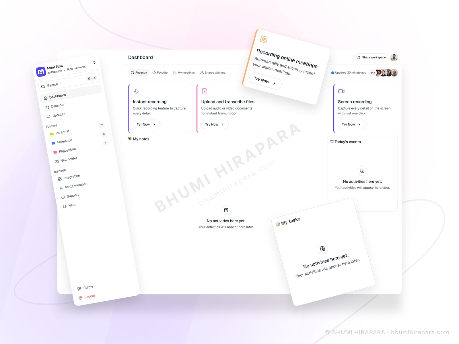
I designed the dashboard to work at both ends of that curve. The three capabilities - instant recording, upload and transcribe, screen recording - are presented as equal action cards with their own entry points, so a new user learns the product by reading the dashboard. Folders, calendar and notes occupy a persistent sidebar, so as content accumulates the same screen becomes an organised workspace rather than needing a different layout.
The outcome
A dashboard that explains the product to a first-time user and still works as a workspace at scale, with empty states that tell people what will appear rather than apologising for being empty.
Empty states are the first-run experience
Most products design the full dashboard and then add empty states as an afterthought, usually a grey icon and the word "nothing". But the empty state is literally the first thing every user sees.
Each empty region here says what will appear there and why. That turns dead space into an explanation of the product, which is the job the screen has to do in the first session and never again.
Three capabilities, three equal doors
Recording, uploading for transcription and screen capture solve different problems for different users. Ranking them would make two of the three feel secondary.
Giving each its own card with its own action means the dashboard functions as the product tour. No modal, no checklist, no overlay sequence - the screen itself carries the explanation.
A sidebar that scales with the account
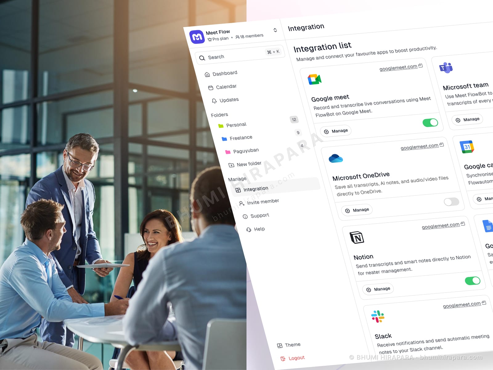
Folders, favourites, shared items and personal notes are the structures that appear once a user has real content. Designing them in from the start means the layout does not have to change as the account fills.
A product whose interface reorganises itself once you become a heavy user punishes exactly the people you most want to keep.