- ClientLymLyt
- Year2025
- RoleUI/UX Designer
- CategoryMarketplace Design
The challenge
Two-sided marketplaces have to serve opposite intents with one product. Brands arrive to find and book talent; creators arrive to track orders, campaigns and money. Building separate products doubles the work, and building one generic product serves neither side well.
What I did
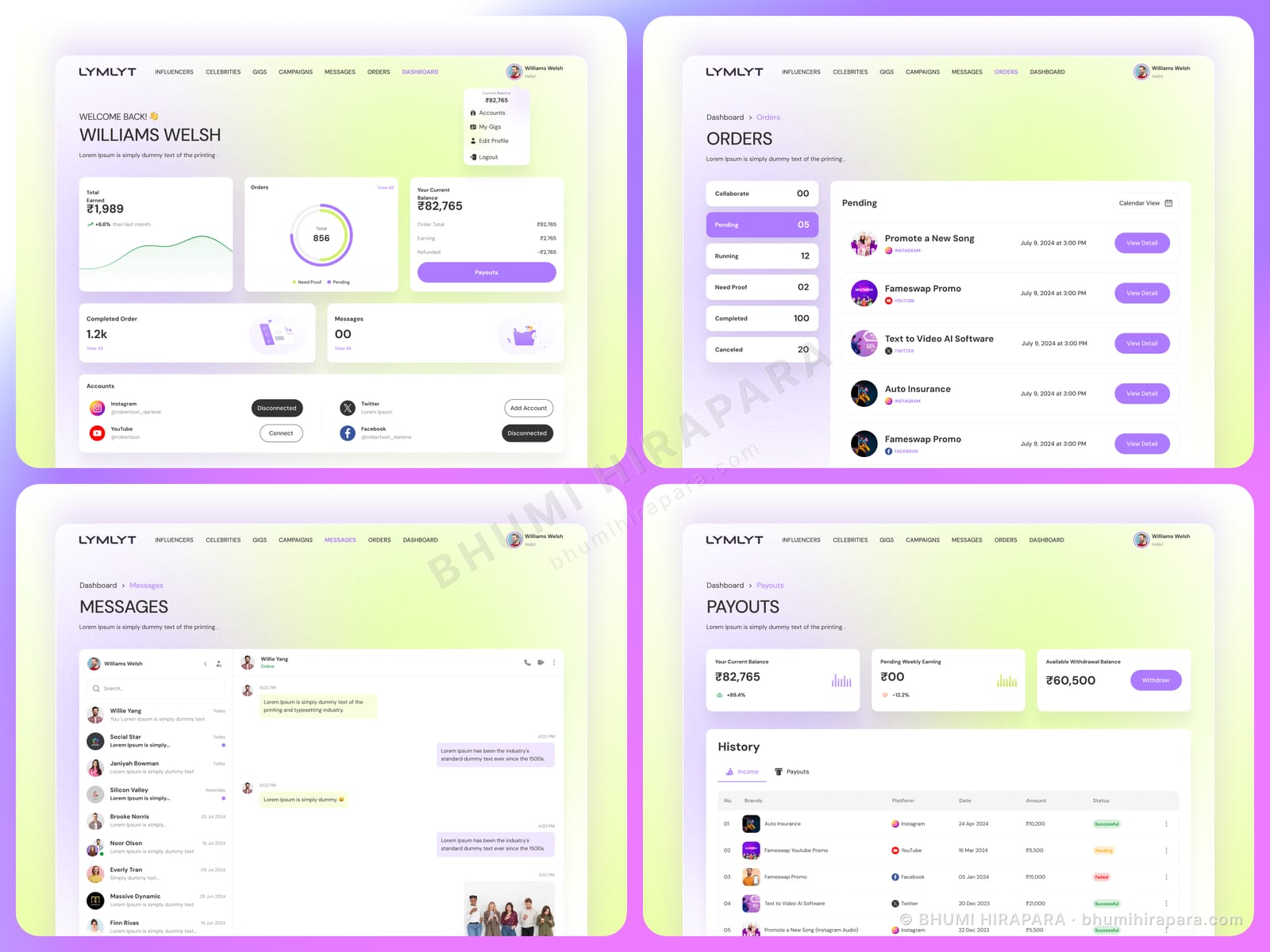
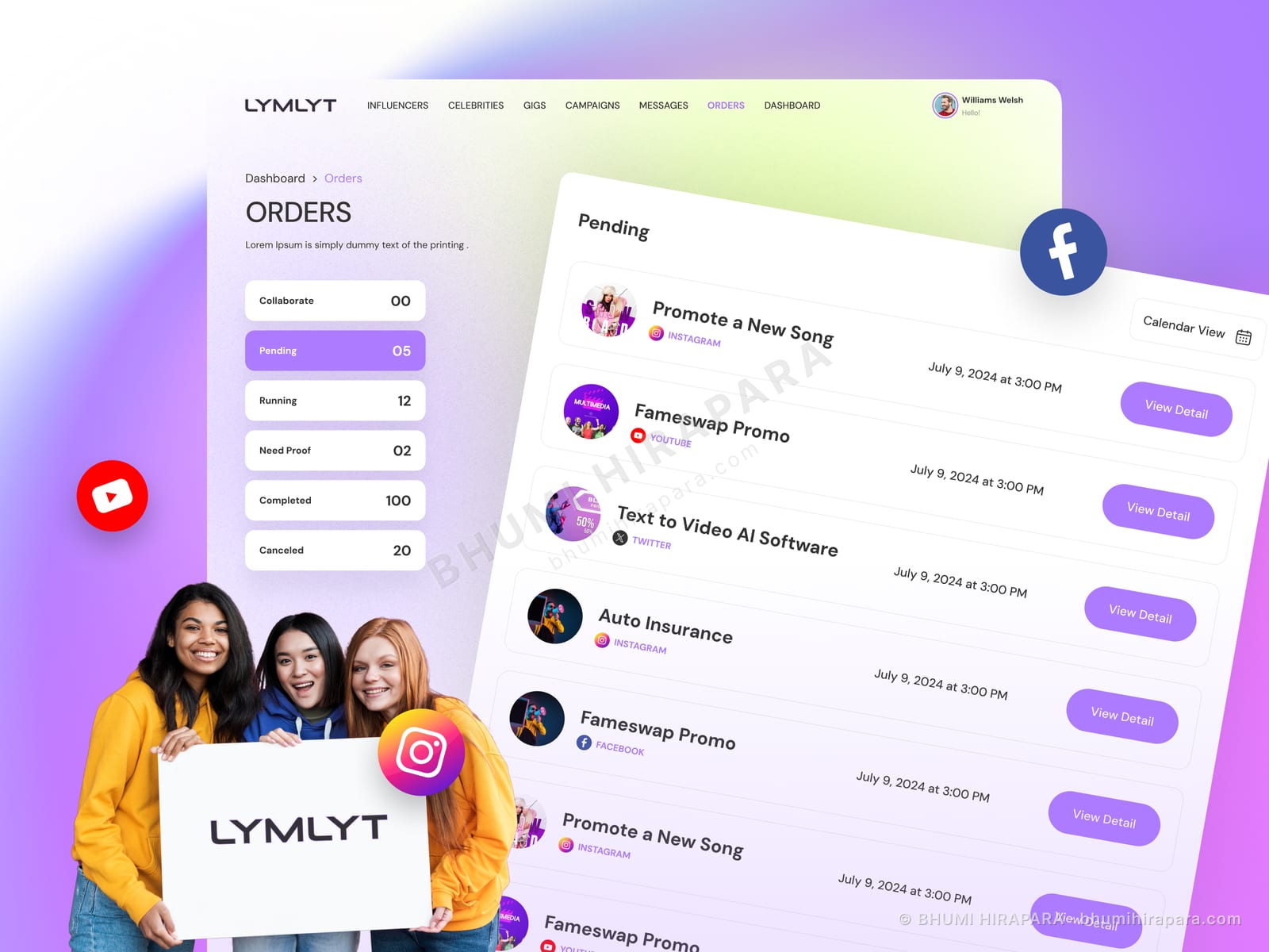
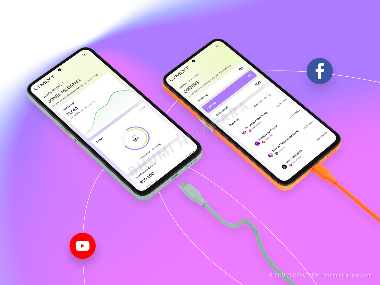
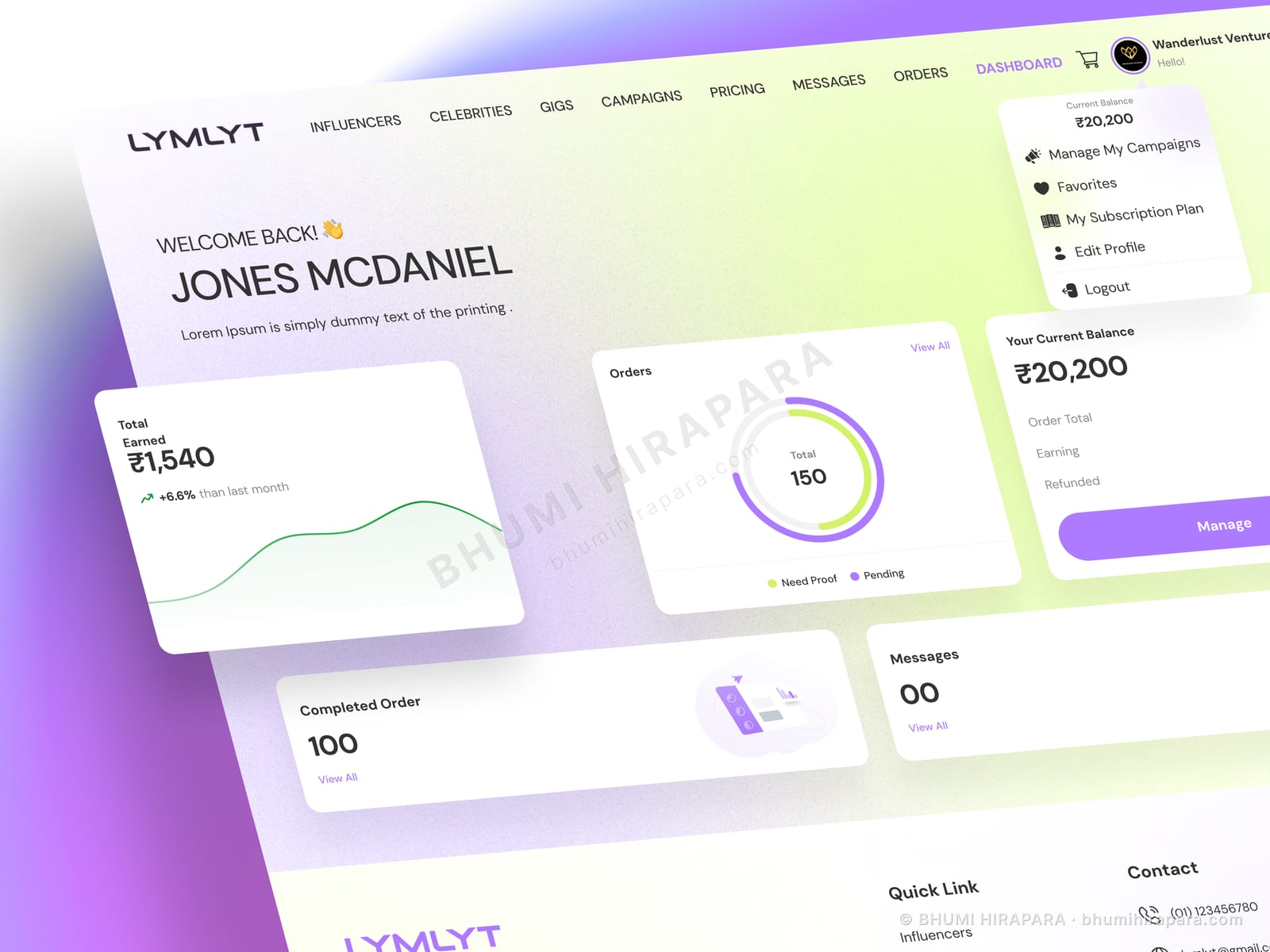
I designed a shared system with a dashboard that reorients by role. For creators the primary figures are total earned, orders, balance and completed work, with campaigns and messages as the working queue. Navigation is kept consistent across both sides so the brand experience reuses the same components with different emphasis. The visual language uses a soft gradient palette that sits comfortably alongside creator photography without competing with it.
The outcome
A single component system serving both sides of the marketplace, with role-specific emphasis instead of role-specific products, and a palette designed to sit behind user-supplied imagery.
One system, two intents
The economical answer to a two-sided marketplace is one design system where the components are shared and the arrangement differs. Brands see discovery and campaign management first; creators see earnings and order fulfilment first.
The alternative - two codebases - is how marketplaces end up with one polished side and one neglected one, usually the side that is not currently the growth priority.
Money is the creator-side headline
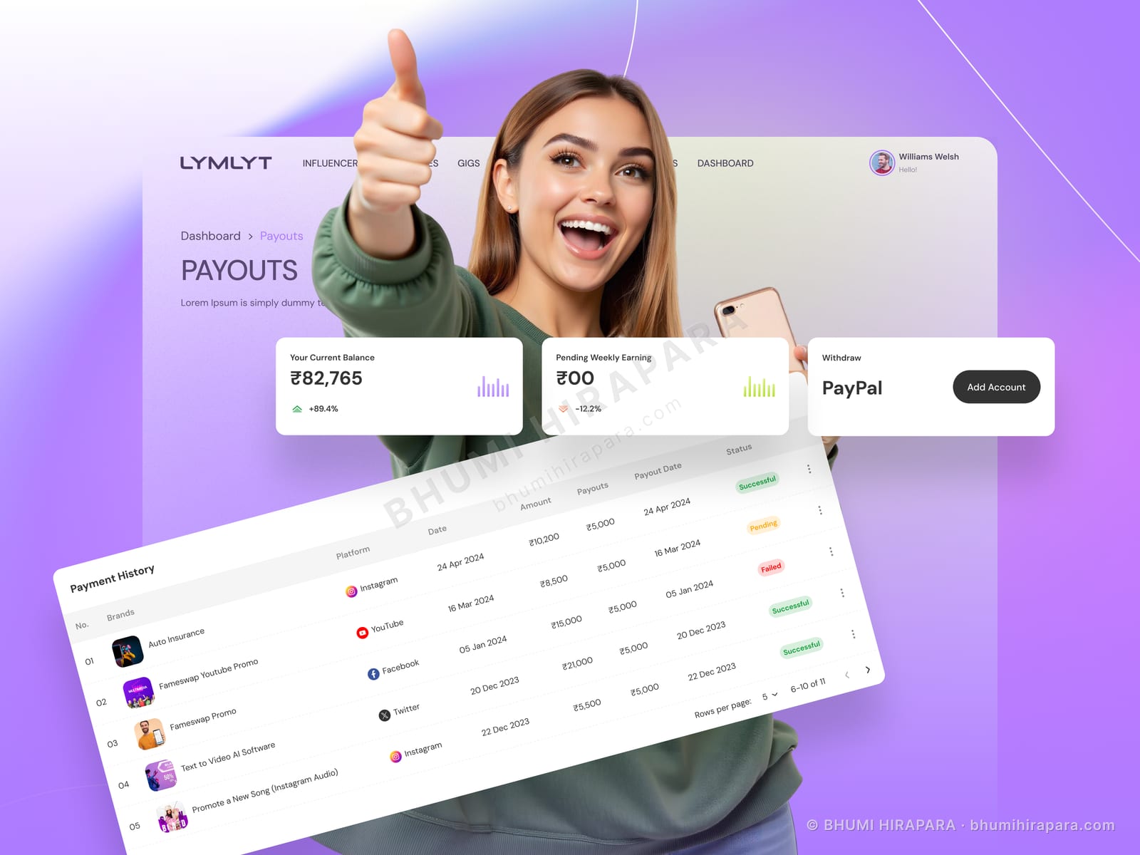
For anyone earning on a platform, the balance is the first thing looked at and the last thing closed. Burying it under an account menu is a trust problem, not just a navigation one.
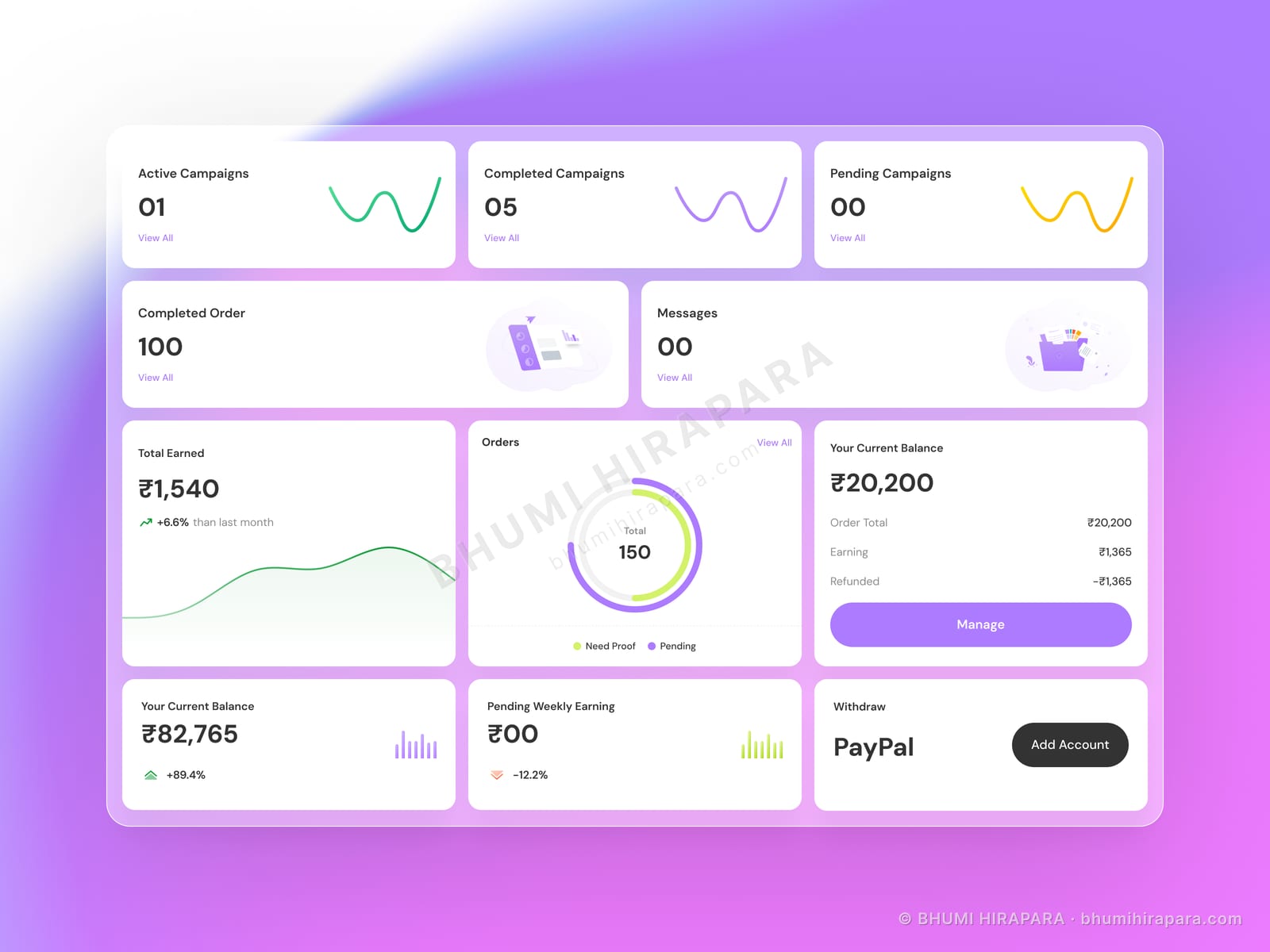
Total earned, current balance, completed orders and pending proof sit across the top in that order, because that is the sequence a creator mentally checks: what I made, what I can withdraw, what is done, what is blocking.
A palette that defers to its users
Influencer platforms are full of user-supplied photography in every imaginable colour. A strongly branded interface fights that content constantly.
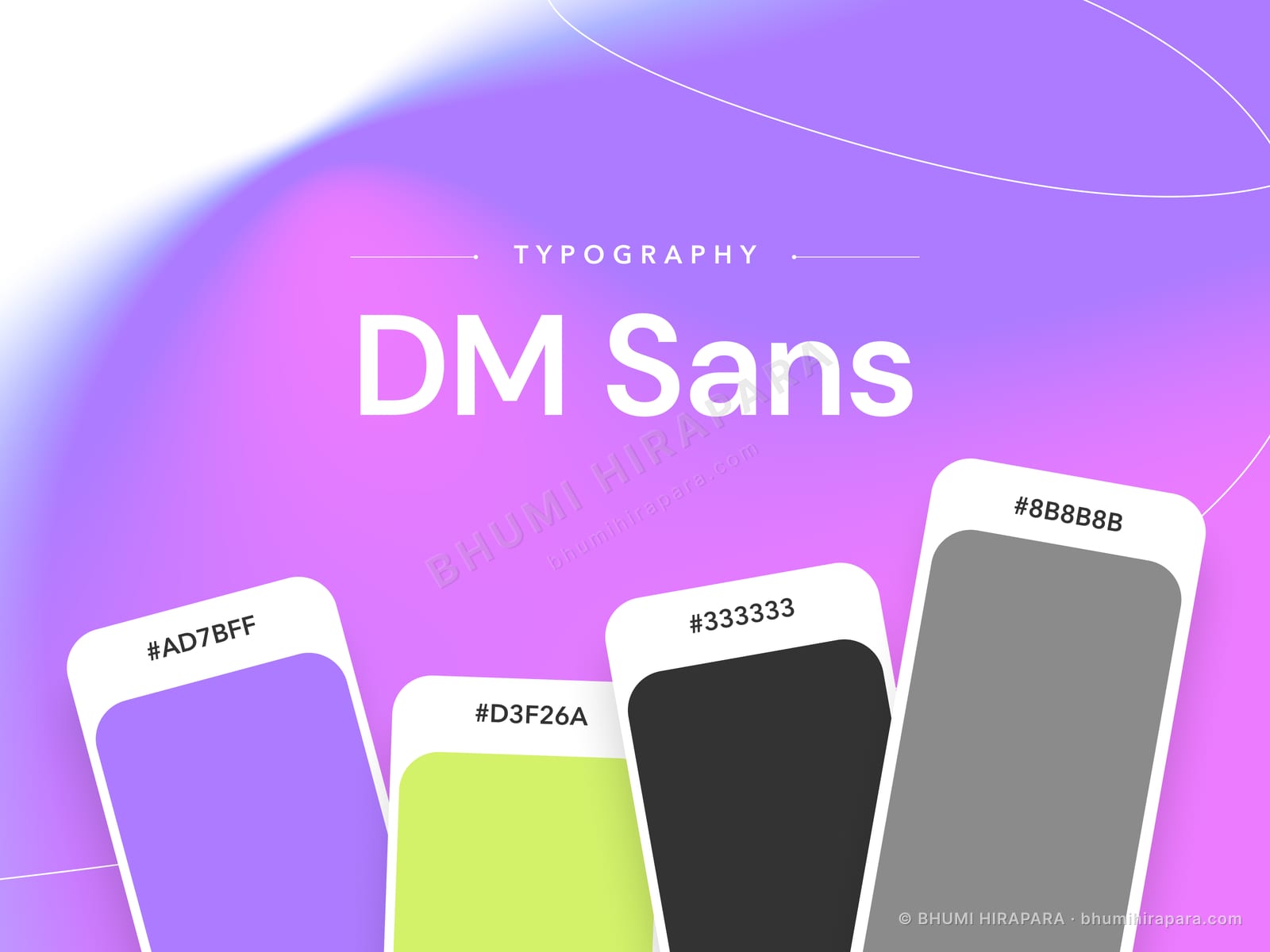
The soft lilac-to-green gradient gives the product its own identity in the chrome while leaving the content areas quiet, so a creator profile looks like the creator rather than like the platform.