- ClientHiker
- Year2025
- RoleUI/UX & Web Designer
- CategoryWeb Design
The challenge
A two-sided marketplace has to look busy and trustworthy to both buyers and sellers from the first screen, and make finding a service effortless.
What I did
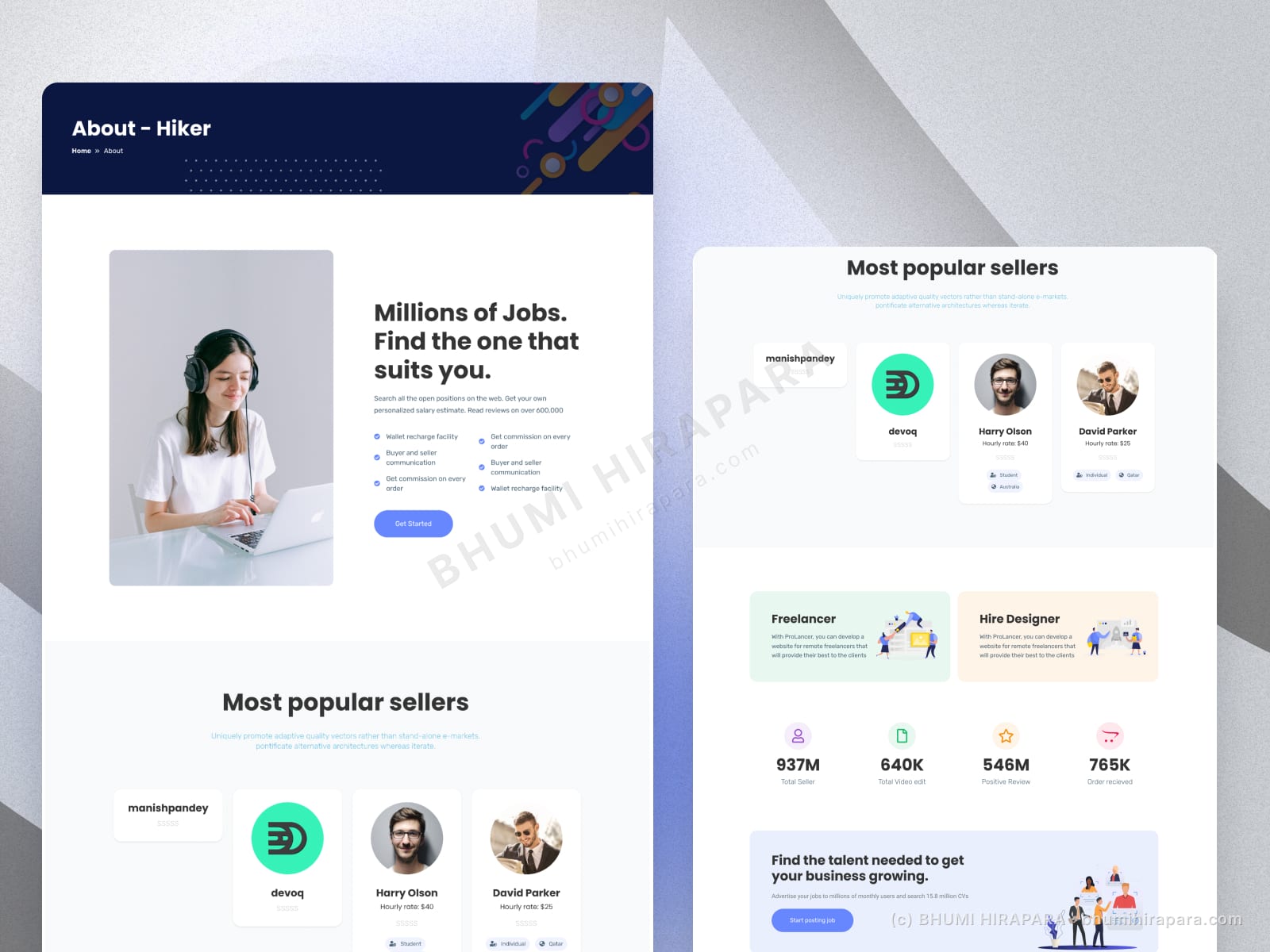
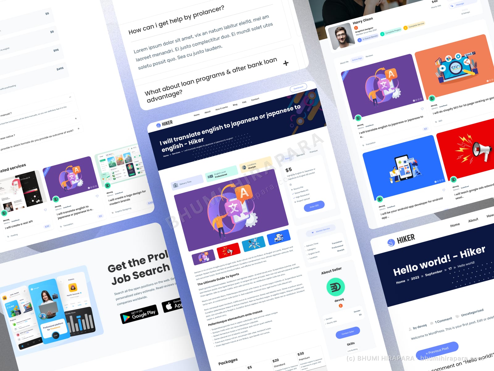
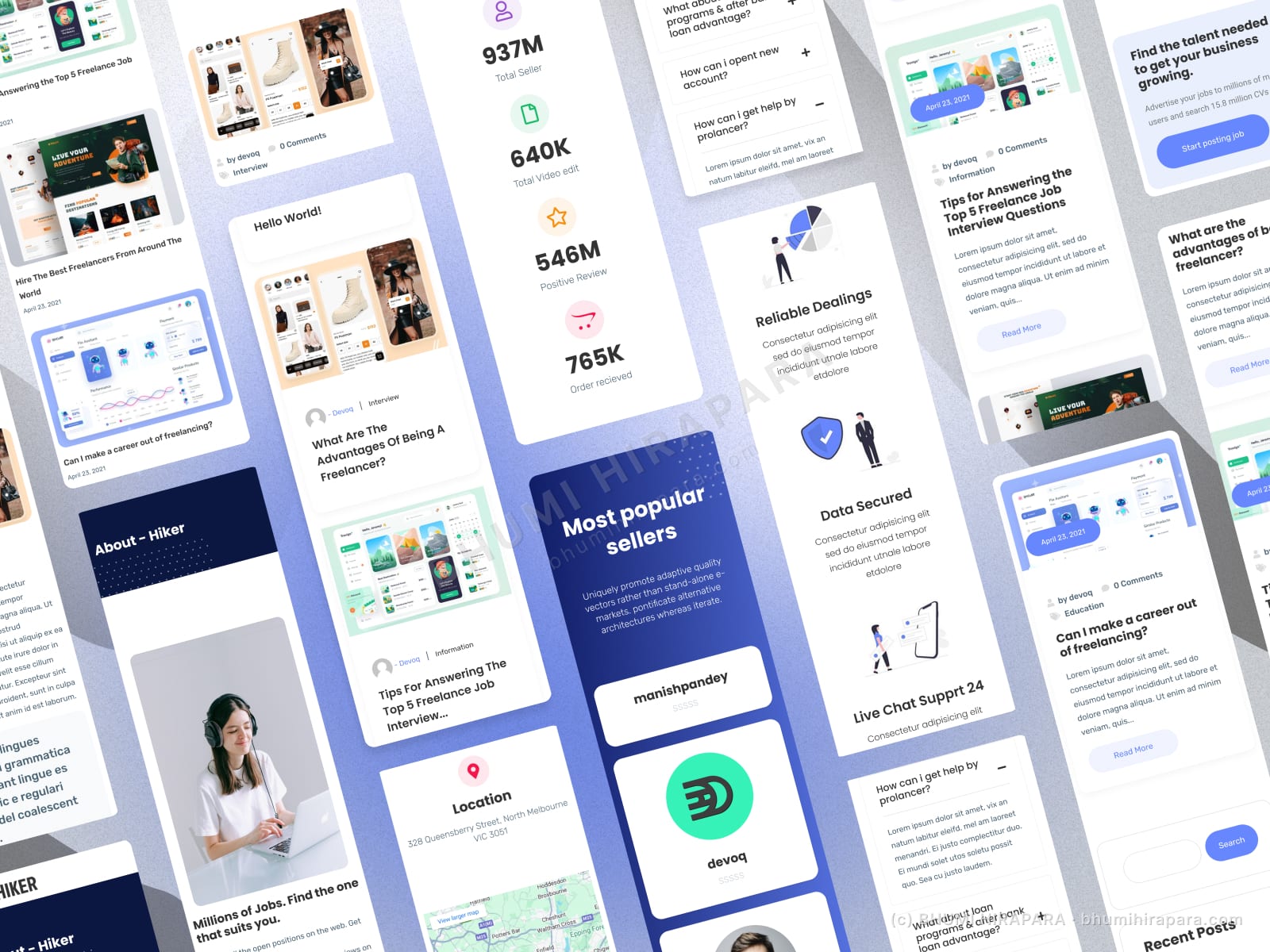
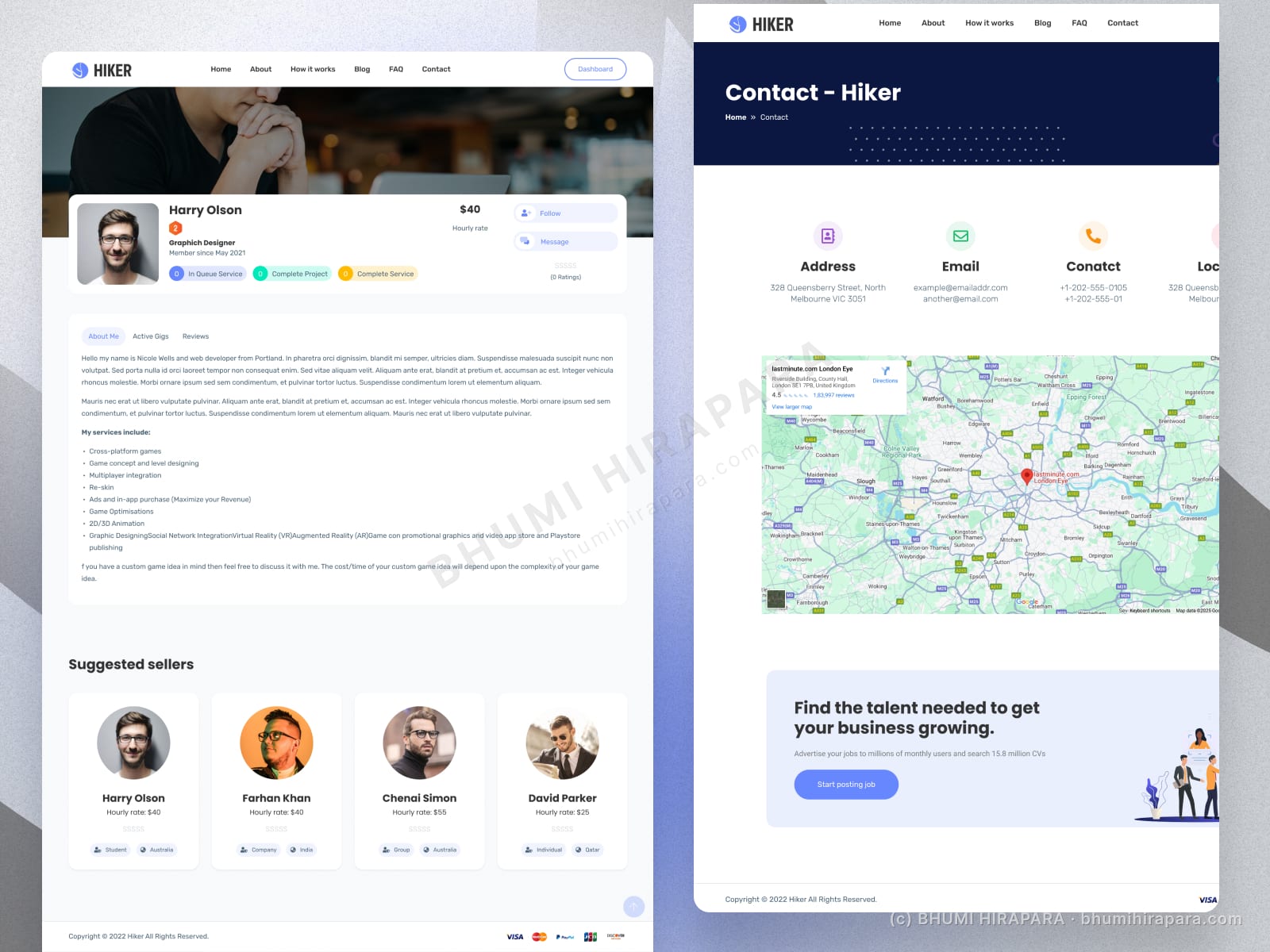
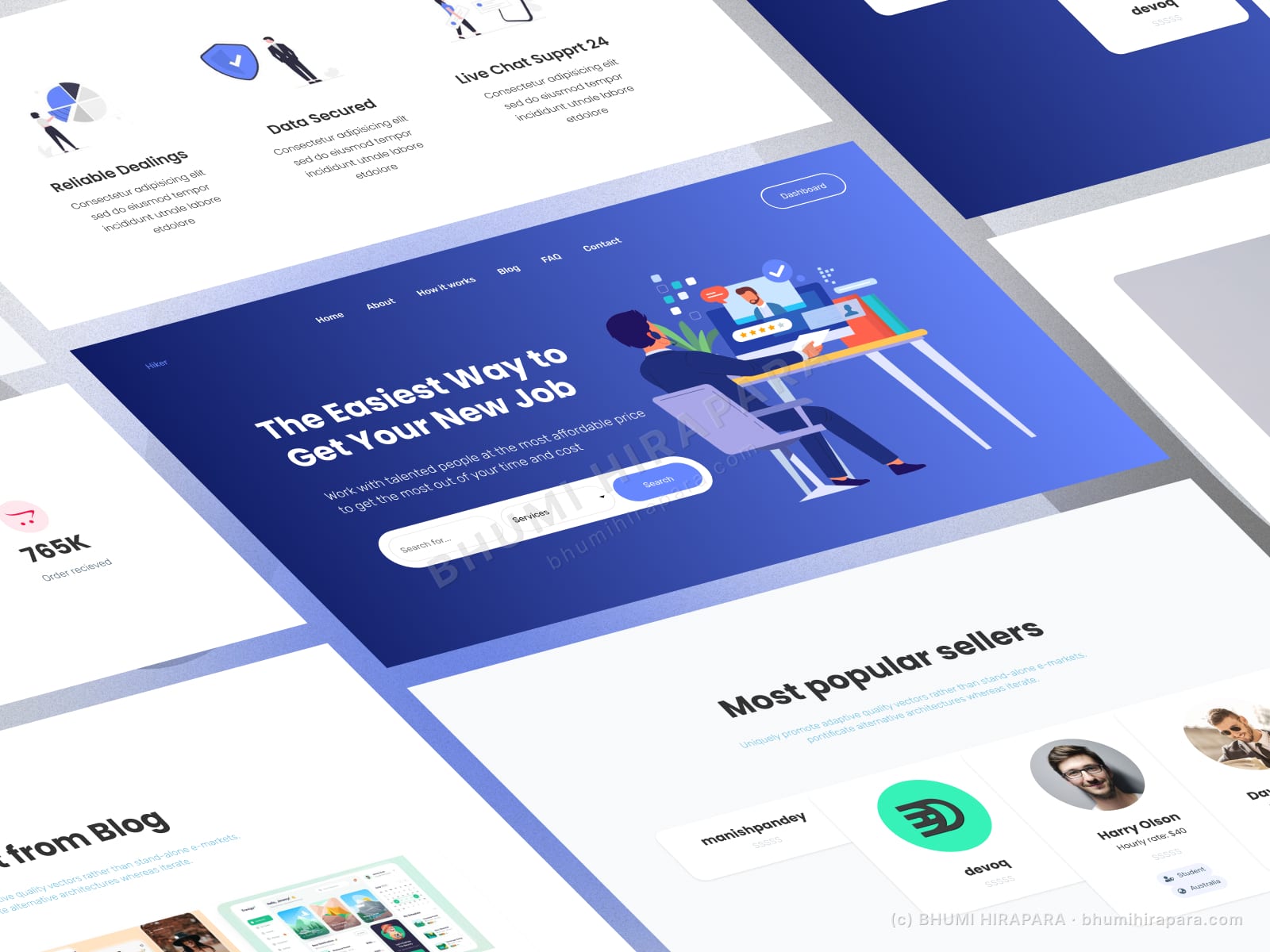
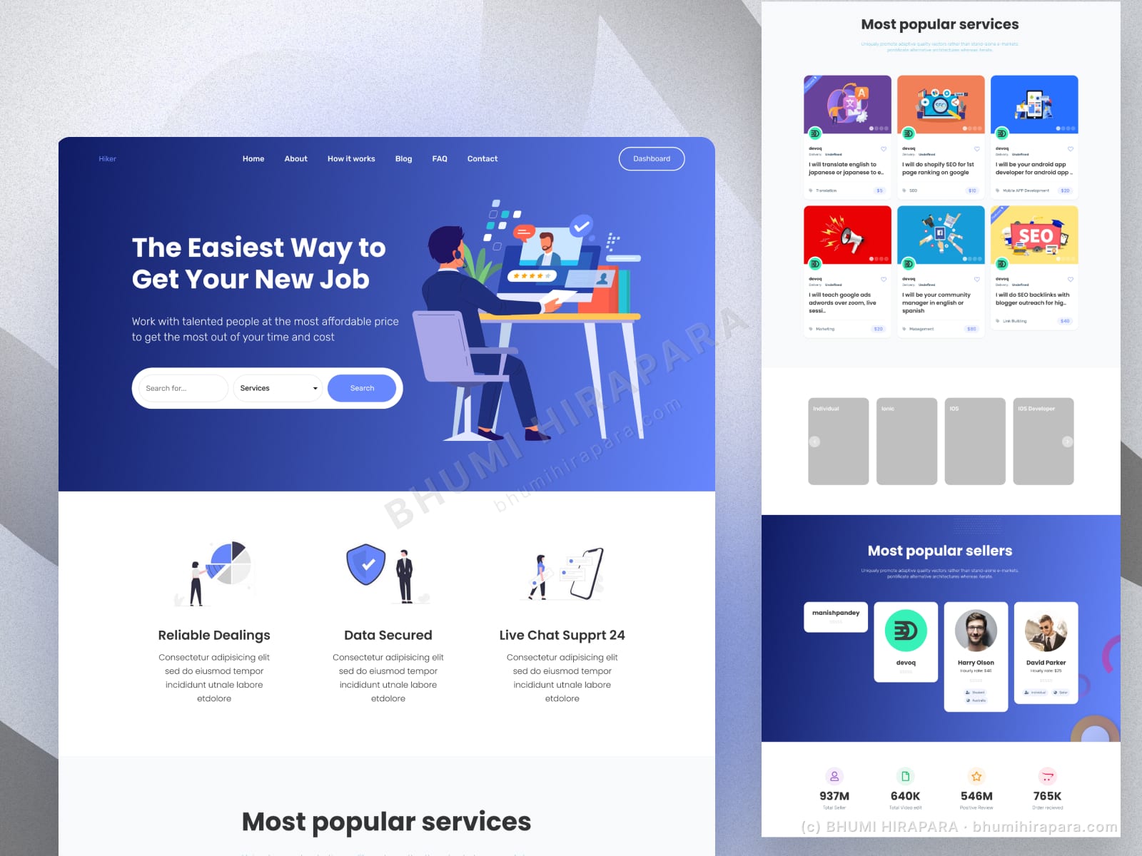
I led with a prominent search, surfaced popular services and top sellers as social proof, and used clear trust signals (secure dealings, live support, headline stats) to make the platform feel established. The layout reuses one card system across services and sellers so the marketplace reads as coherent.
The outcome
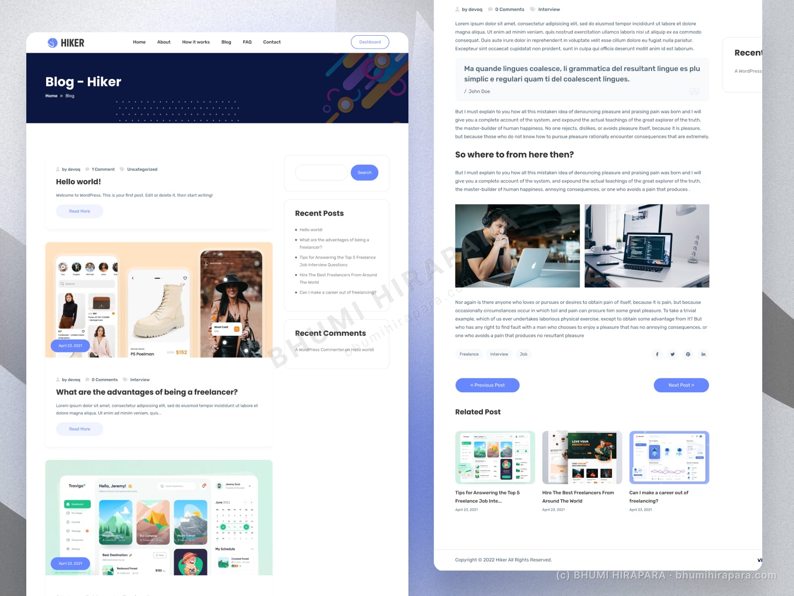
A marketplace homepage that puts search first, proves activity with popular services and sellers, and uses a single card system to stay coherent as listings grow.
Search first, everything else second
On a marketplace, the fastest path to value is search. I gave it the hero so a visitor can act immediately, with popular services underneath for those who want to browse.
Proof that the marketplace is alive
Empty-looking marketplaces lose trust. Top sellers, popular services and headline numbers signal activity, which is what convinces both buyers and sellers to join.