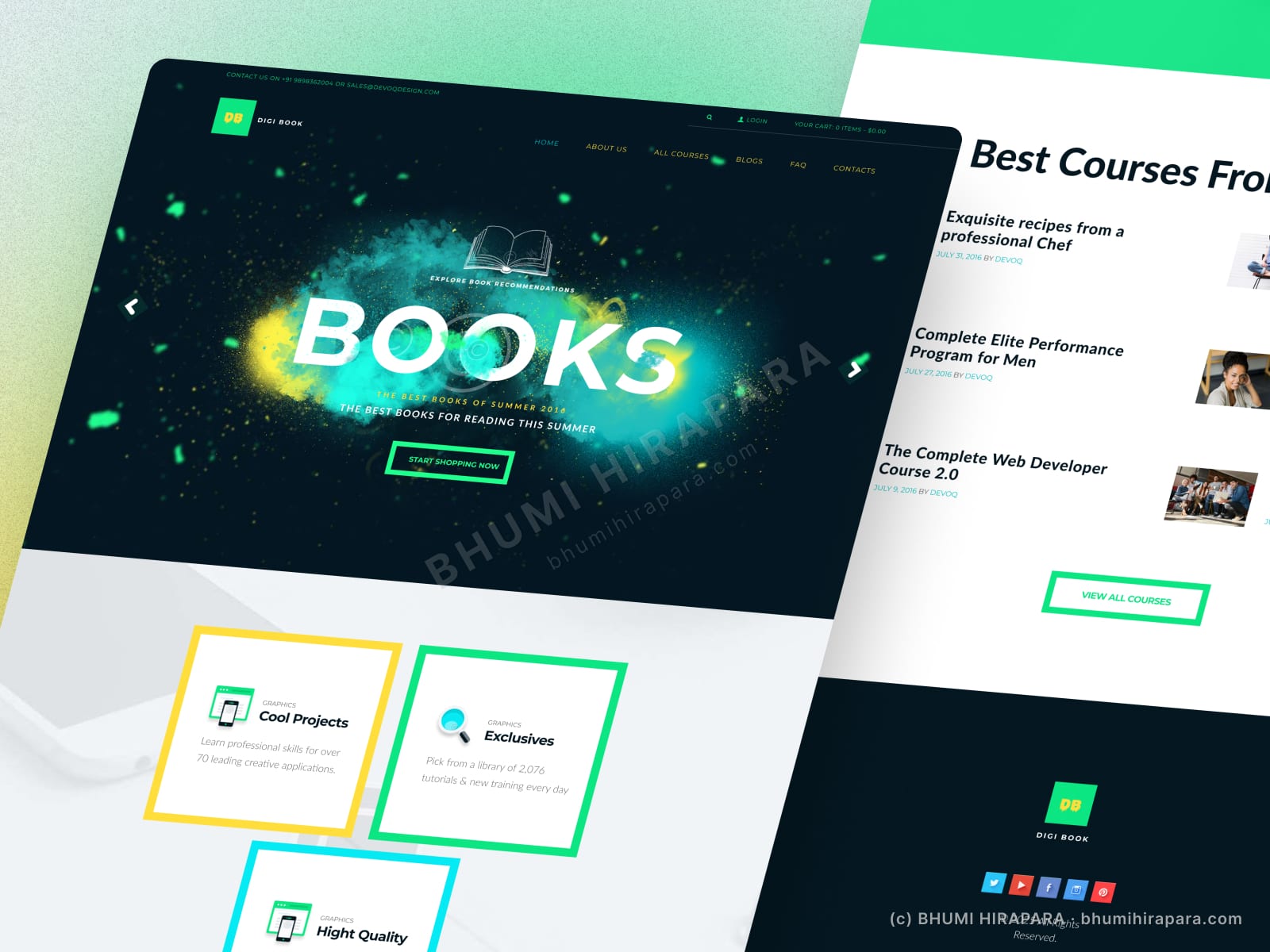
- ClientDigi Book
- Year2025
- RoleUI/UX & Web Designer
- CategoryWeb Design
The challenge
A learning platform has to make a large catalogue feel navigable and make starting a course effortless, while standing out from generic course marketplaces.
What I did
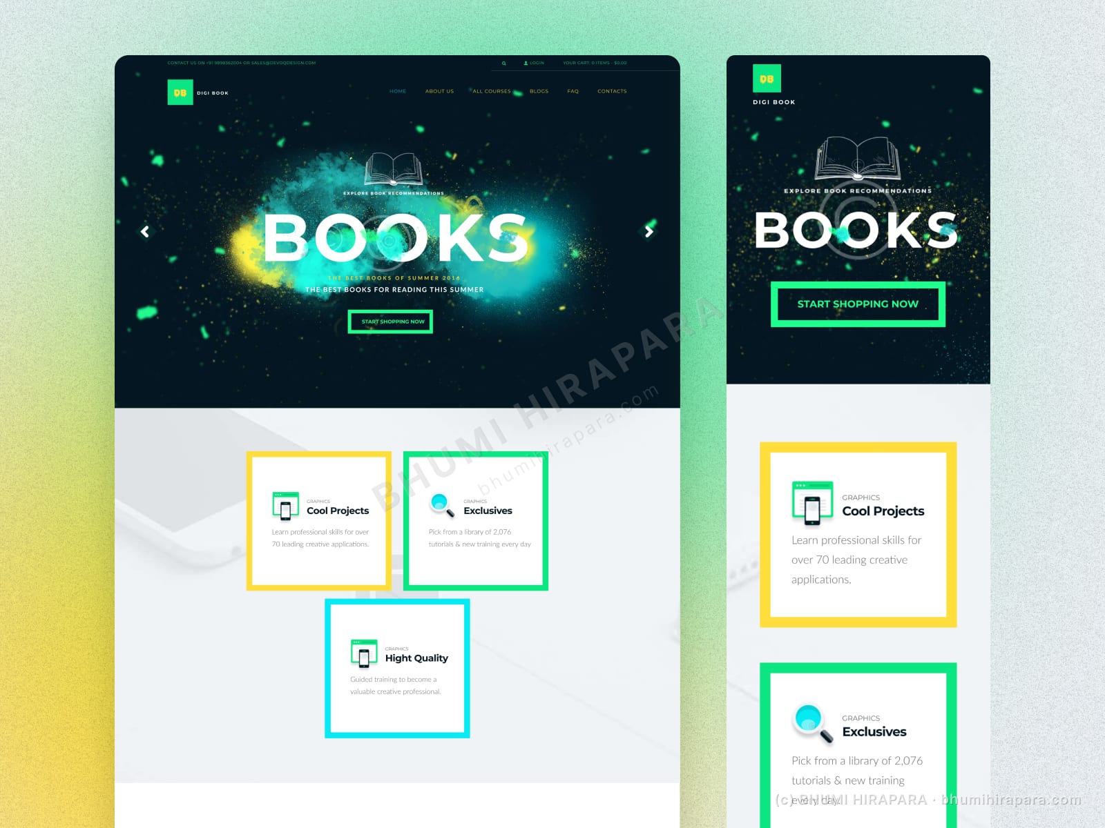
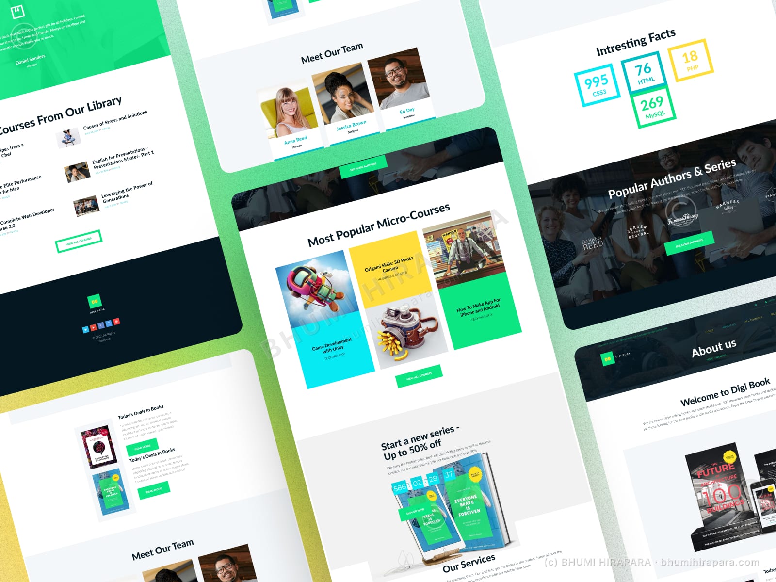
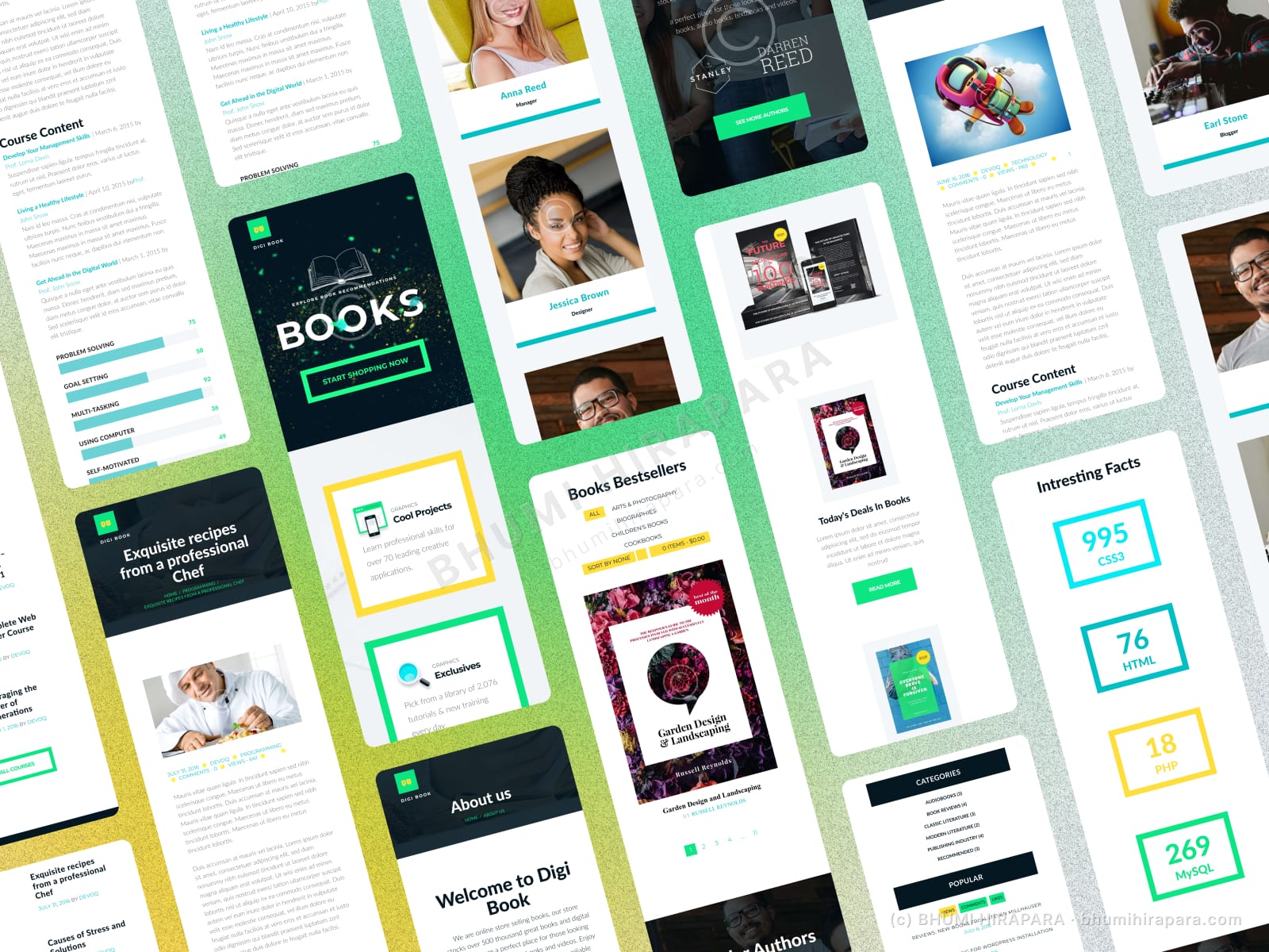
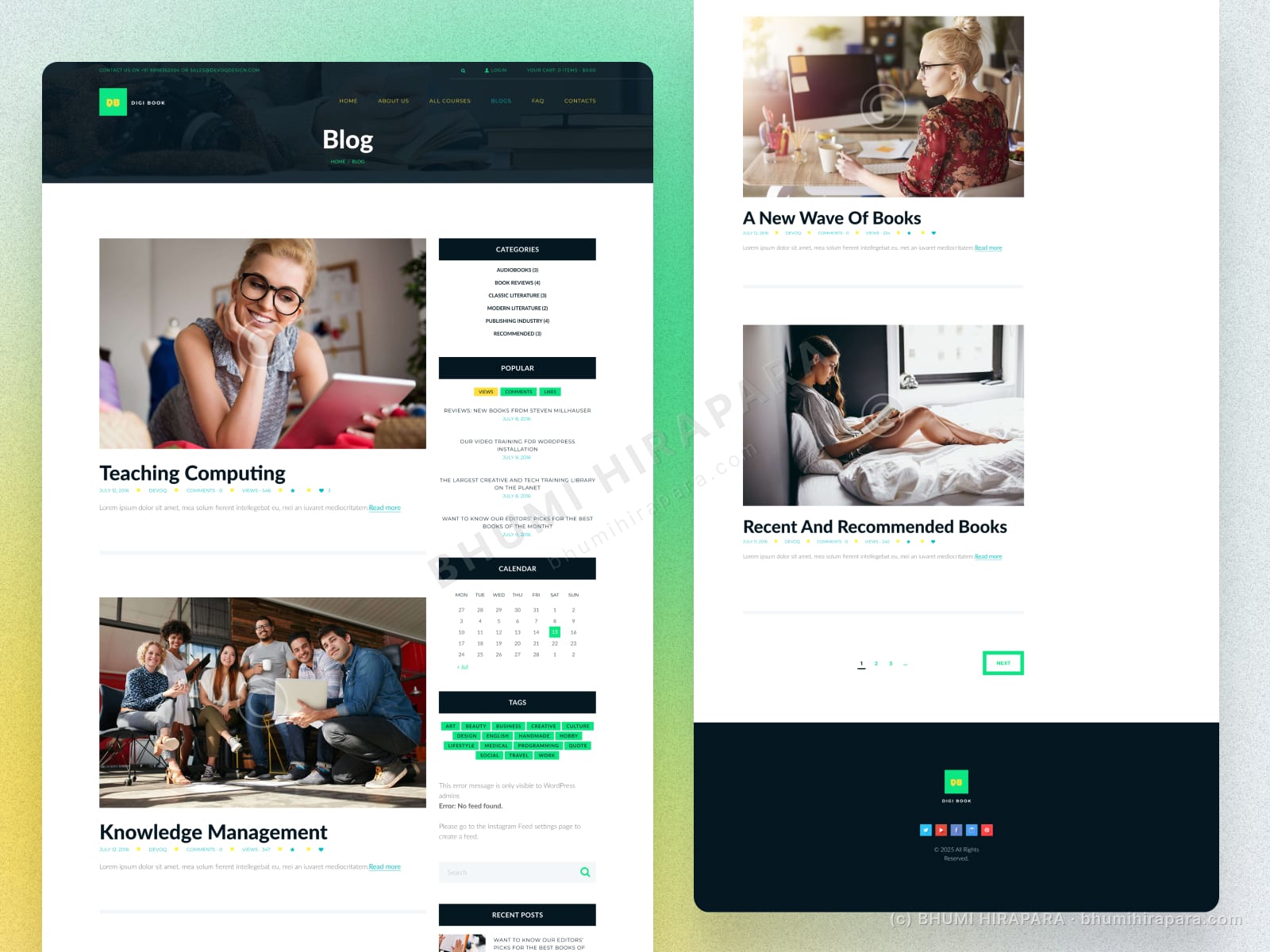
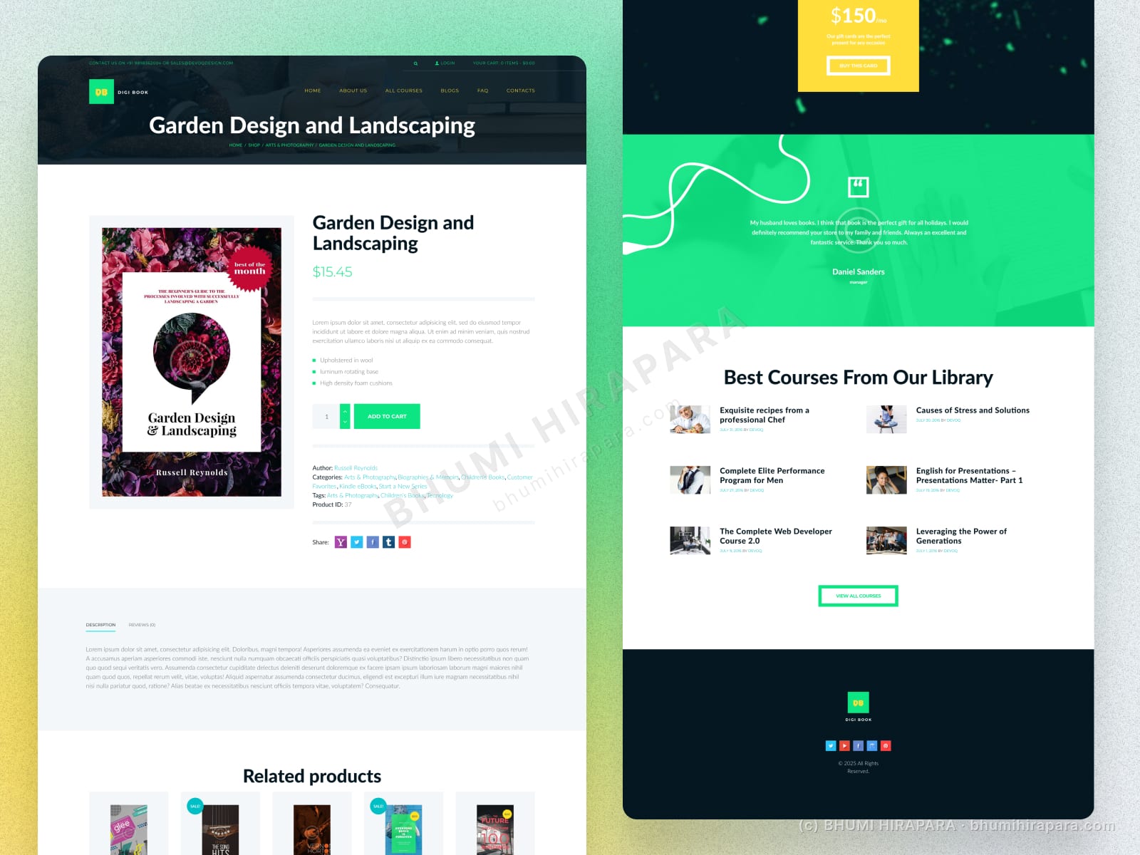
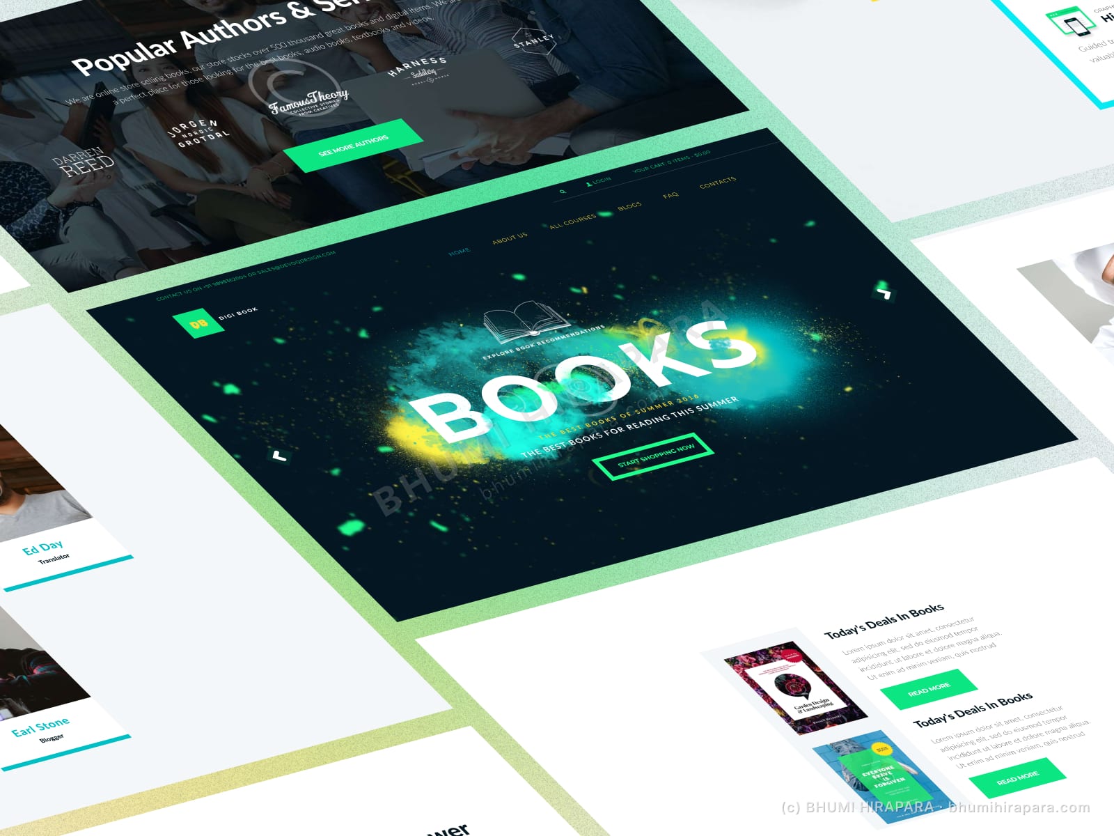
I used an energetic dark hero with vivid accents to give the brand character, surfaced featured courses prominently, and structured categories so a learner can find the right course quickly. Course cards use one system so the catalogue stays coherent as it grows.
The outcome
A learning platform that makes a big catalogue navigable, surfaces the best courses first, and keeps enrolling simple.
A catalogue that does not overwhelm
Large course libraries intimidate. Featuring the best courses and organising clear categories gives a learner a confident starting point instead of a wall of options.
Character without losing clarity
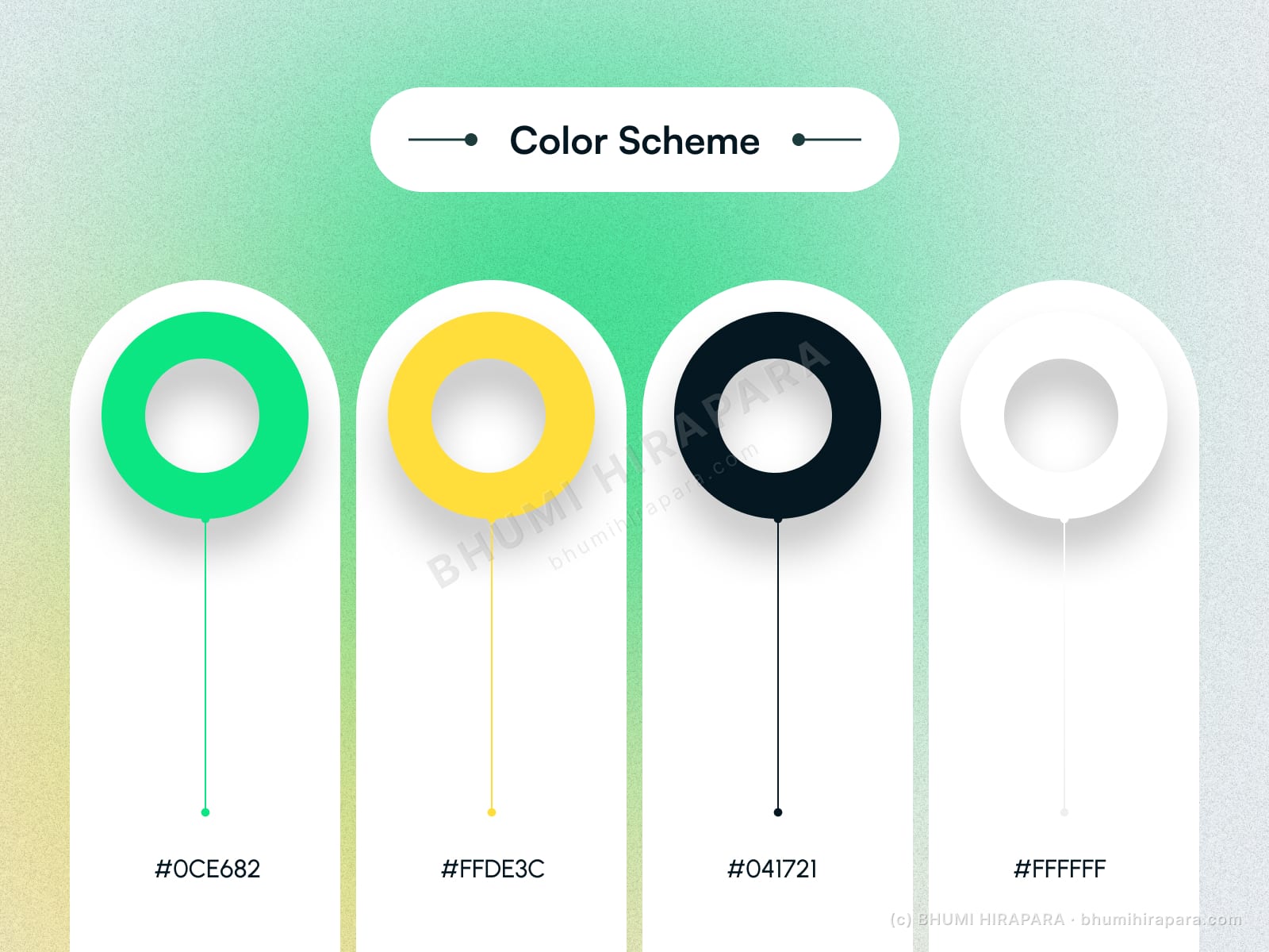
An energetic dark theme gives the brand personality, while a consistent course-card system keeps the growing catalogue readable.