

- ClientCat Connoisseurs
- Year2024
- RoleUI/UX Designer
- CategoryWeb Design
The challenge
The existing site buried its best content. New visitors landed on a homepage that explained the organisation rather than showing what the community actually offered, and the path to joining was hidden two levels into the navigation. Traffic was healthy but sign-ups had flattened.
What I did
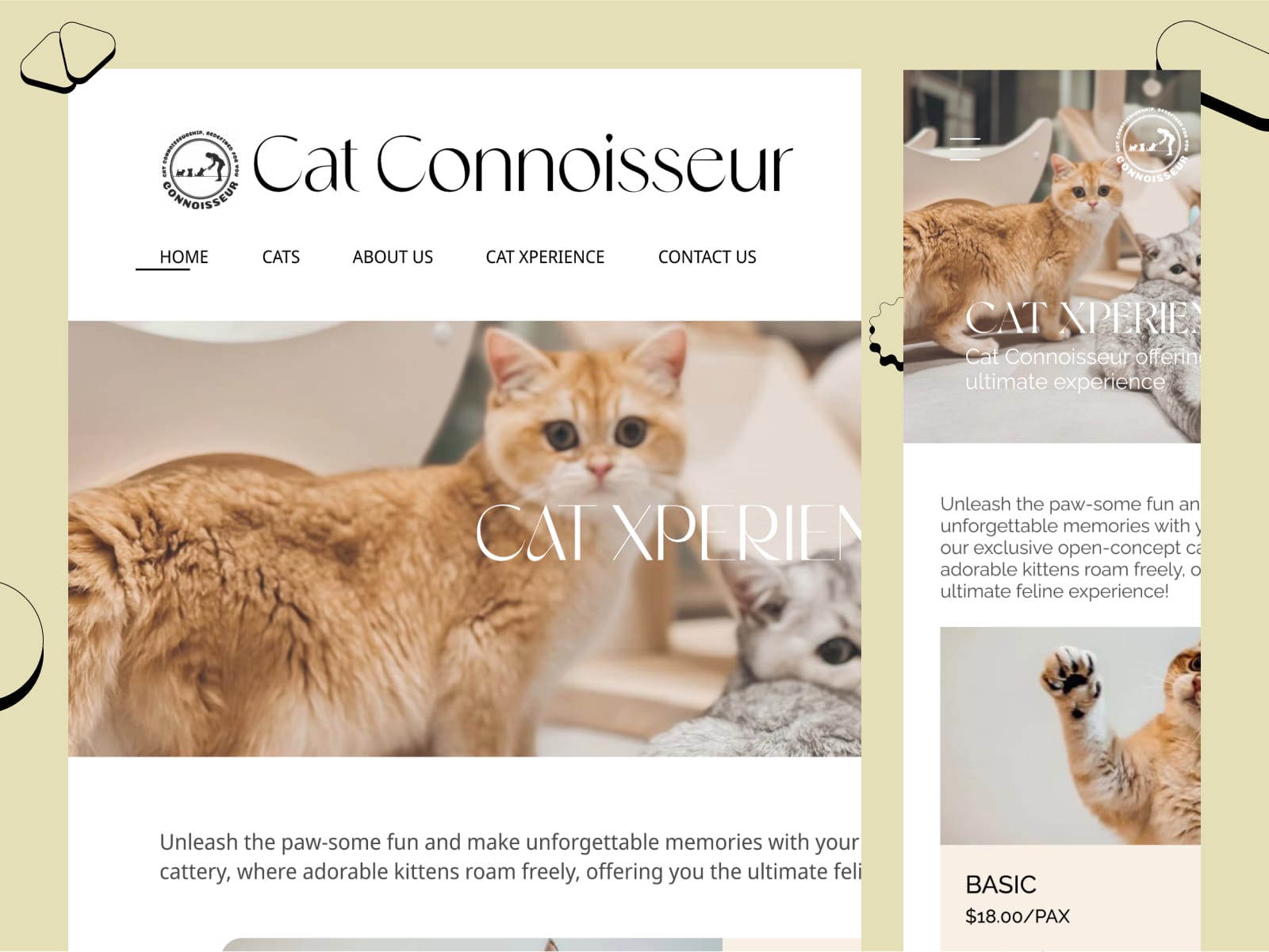
I restructured the site around what visitors came for. Content discovery moved to the front, with the strongest articles and imagery surfaced on the homepage instead of held back behind a generic introduction. The path to joining was reduced to a single, consistently placed action visible from any page. The visual design was kept deliberately light and content-led so photography and writing carried the pages rather than competing with interface decoration.
The outcome
A clearer structure that puts the community itself on the homepage, a consistent component set the team can extend without a designer, and a sign-up path that is visible from anywhere on the site rather than buried in navigation.
Starting with what people came for
The first thing I did was separate what the organisation wanted to say from what visitors arrived wanting. Those are rarely the same list. The site led with mission and history; visitors were looking for content, community and a reason to join.
Reordering the homepage around the visitor's priorities rather than the organisation's org chart is unglamorous work, but it is usually the single change that moves the numbers most.
A component set the team can run
The previous site had drifted because every new page was laid out slightly differently. I built a small, documented set of components - article cards, feature blocks, calls to action, section headers - with clear rules on when to use each.
That gives the team a way to publish new pages that still look like the site, which matters more than any single page design once a designer is no longer involved.