- ClientGaolo
- Year2025
- RoleUI/UX Designer
- CategoryDashboard Design
The challenge
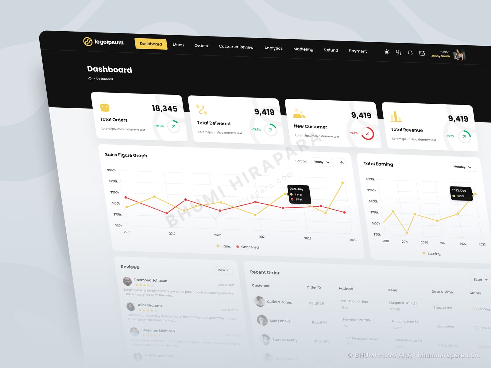
Food delivery operations are read in minutes, not months. The dashboard had to be legible on a screen glanced at mid-service, while still carrying the sales and earnings detail an owner reviews after close.
What I did
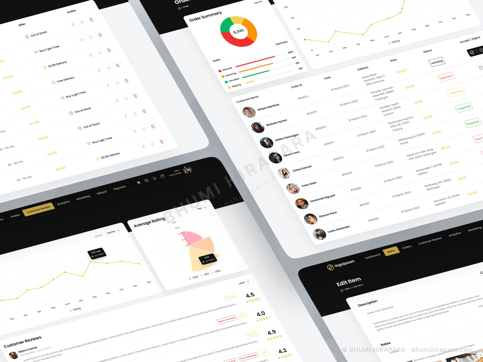
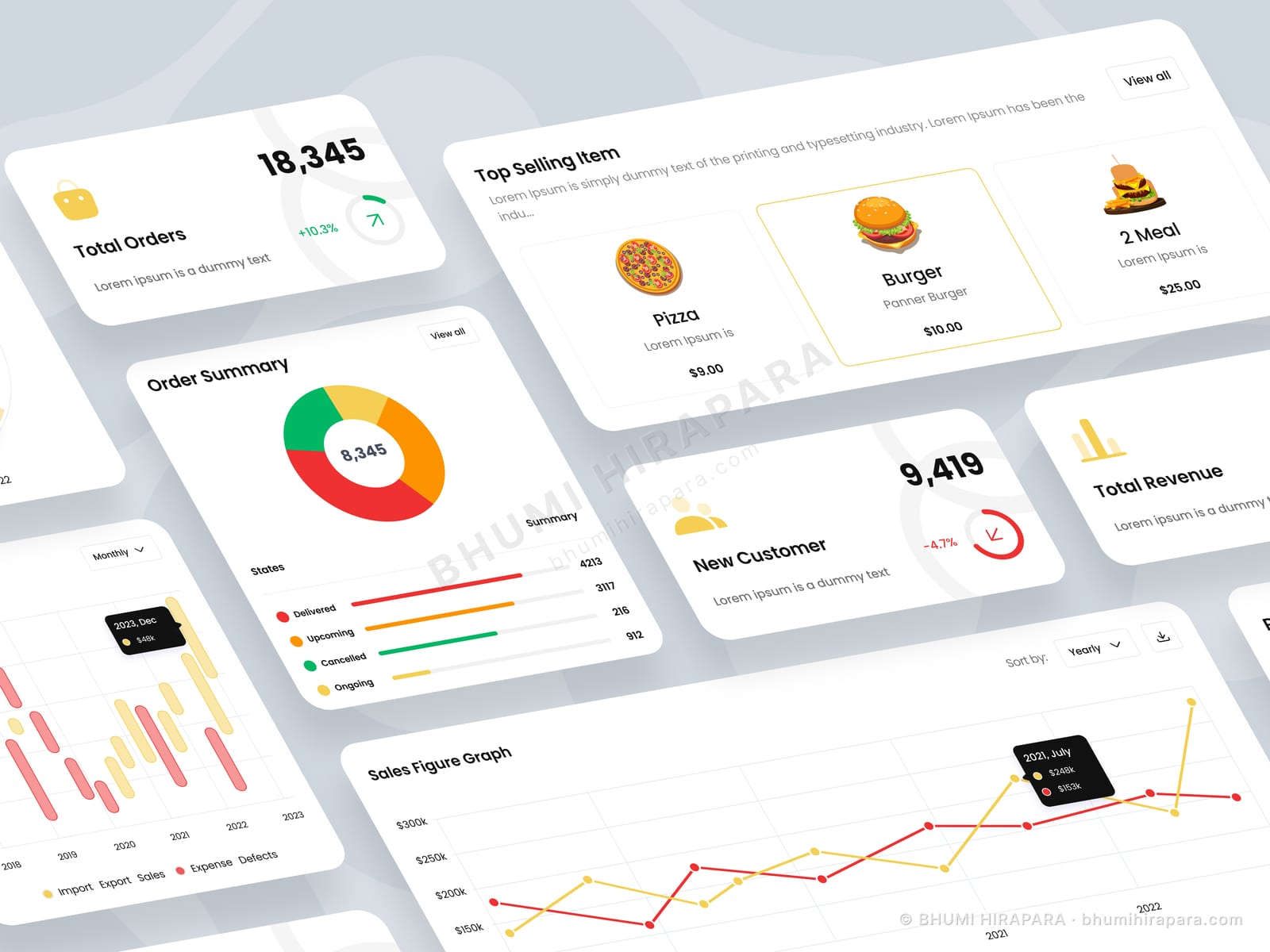
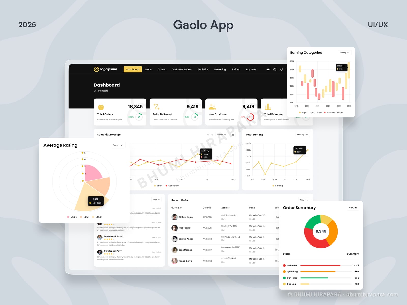
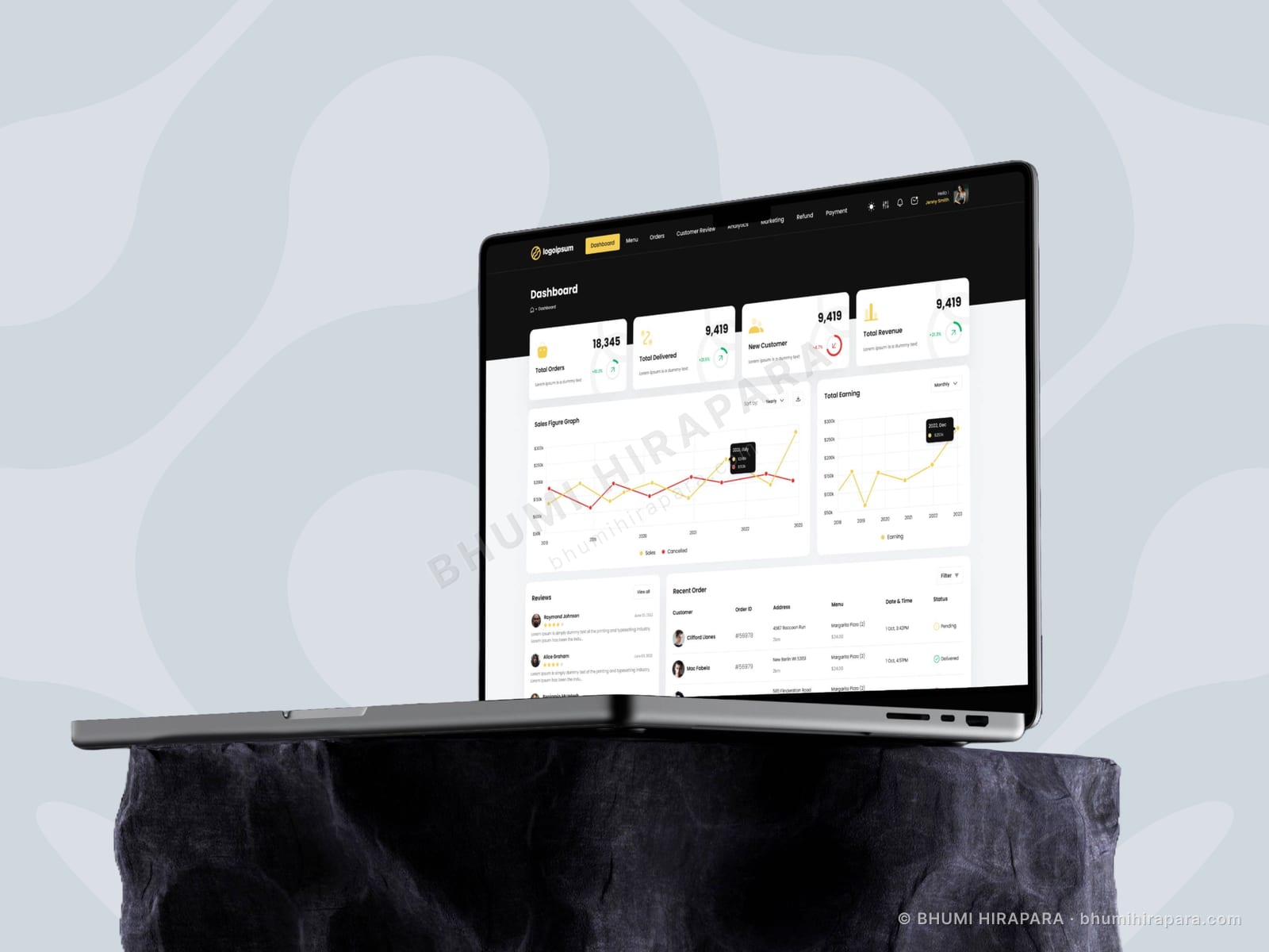
I split the screen by time horizon. The top row carries the four live figures - orders, delivered, new customers, revenue - each with movement. Beneath that, sales and earnings graphs serve the end-of-day review, and the lower half holds recent orders with the operational detail that matters during service: address, menu, delivery time and status. A dark navigation bar with a single accent colour keeps the chrome out of the way of the data.
The outcome
A dashboard that reads in seconds during service and still holds the detail for an end-of-day review, with status carried by colour so order state is scannable without reading.
Two audiences, two time horizons
The same screen serves someone checking between orders and someone reviewing the day. Those need different information densities, and the usual compromise serves neither.
Splitting vertically by horizon - live figures at the top, analysis in the middle, operational detail below - lets each reader stop at the depth they need rather than scanning past what they do not.
Colour reserved for status
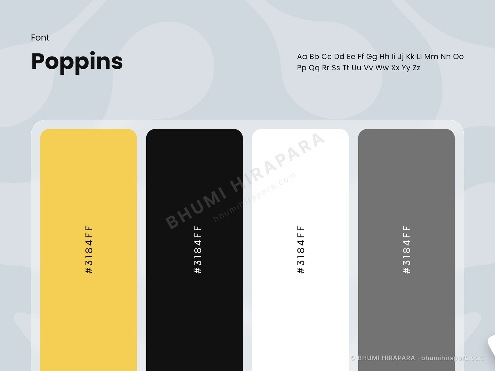
In an operational interface, colour used decoratively is colour that cannot be used for meaning. The chrome here is near-black with one accent, which leaves the full palette available for order state.
A delivered, pending or cancelled order is then identifiable without reading the label, which is the entire point during a busy service.
The order table is the product
Charts get the attention in dashboard design, but in food operations the recent order table is where the work happens. It needed the address, items, delivery time and status visible without expanding a row.
Everything else on the screen is context for that table, and it is laid out accordingly rather than being squeezed in below the visualisations.